Group14
Board Decks
Environmental Design
Wayfinding
Animation Systems
Video
Photo
Sound Design
Design Systems
Press Kit
Social Media
About
Group14 is driven by the idea of electrifying everything, and this important yet simple idea has allowed them to build a powerful answer to todays energy issues. When I joined Group14 the lack of a visual brand story was evident and I planned to change that.
Environmental Design
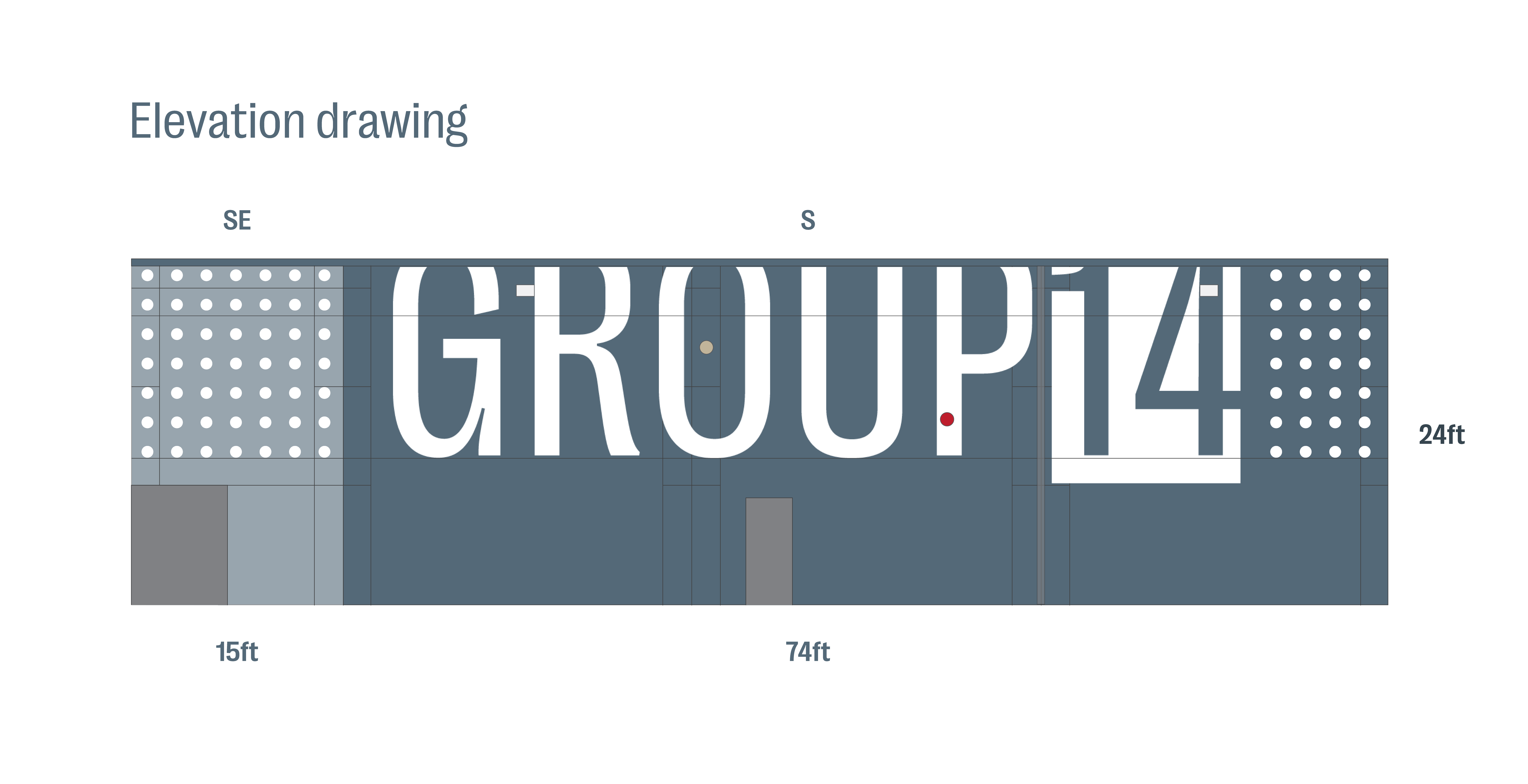
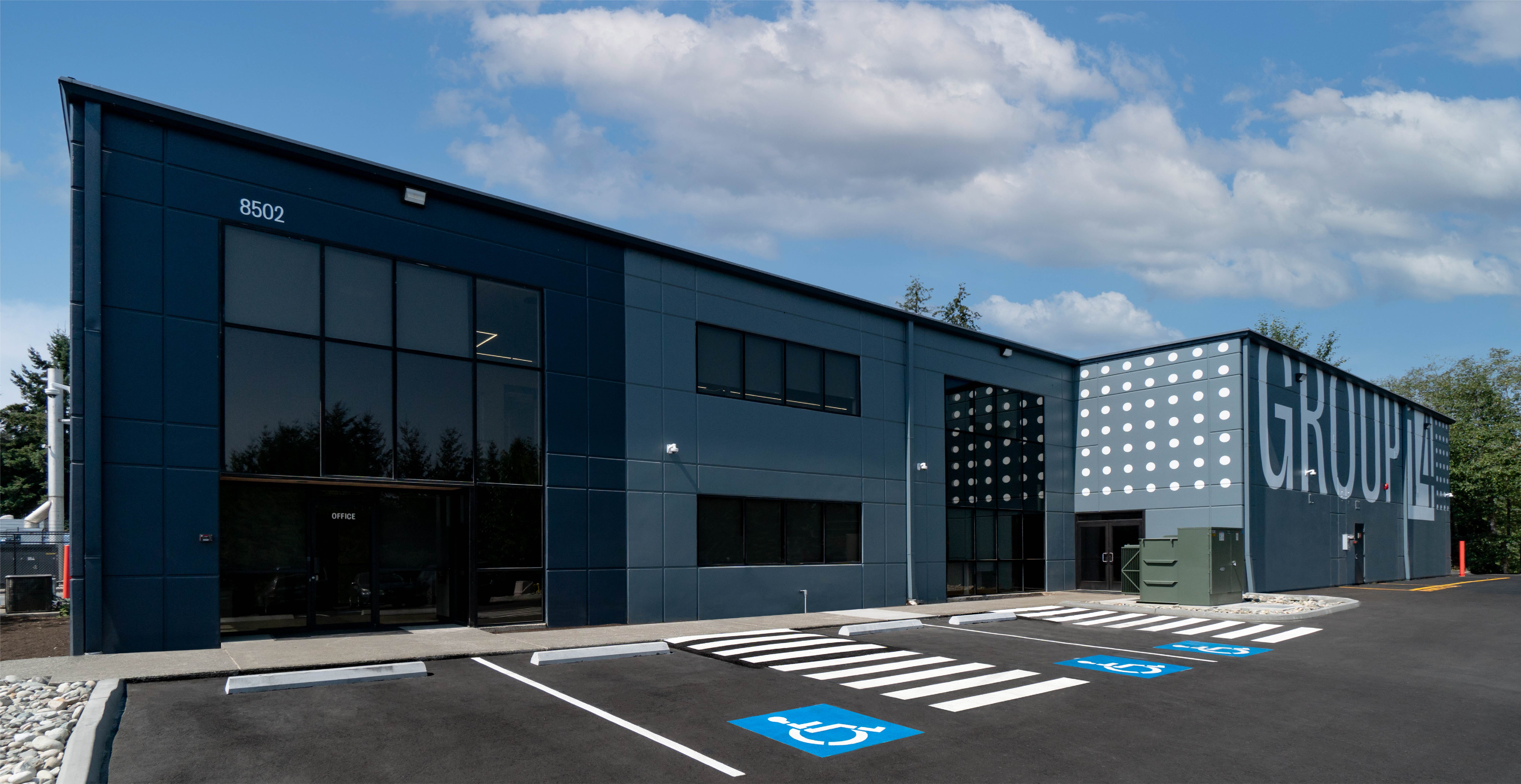
I began this project by studying the building blueprints to create an elevation drawing, then I concepted supergraphic ideas. The brand design system includes dot tape - an asset I used to tie the supergraphic together from the South East to the South wall. To add mystery and suspence the logo is slightly cropped at the top - this effect adds grandeur and enables the graphic to feel larger than the building.
Animation
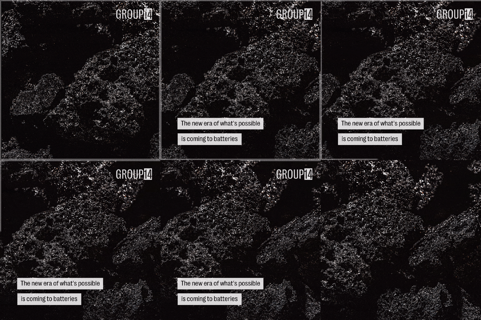
To develop social media content more efficiently I developed a design system with animated elements. Using Duane Kings brand guidelines I created a visual style for all of Group14’s video content. This allowed marketing to highlight any area of the business with photos or videos and have copy overlayed.
Animating the outro was it’s own project. The supergraphic project gave me the idea to tie together the dot tape to the logo using animation. Group14’s technology Dryrolysis™ and Siligenesis™ are both represented in the outro when the dot tape is half filled, turning to fully filled. My idea was a smooth swipe that was almost fluid: on the right you can see a gif at 25% speed - as well as a full speed video with sound.
A video design system would not be complete without a memorable outro sound, and I found two sounds to layer for that desired effect. These sounds had multiple sources of inspiration, and thus the pitch had to be adjusted to create the sound in mind.
Press Photos
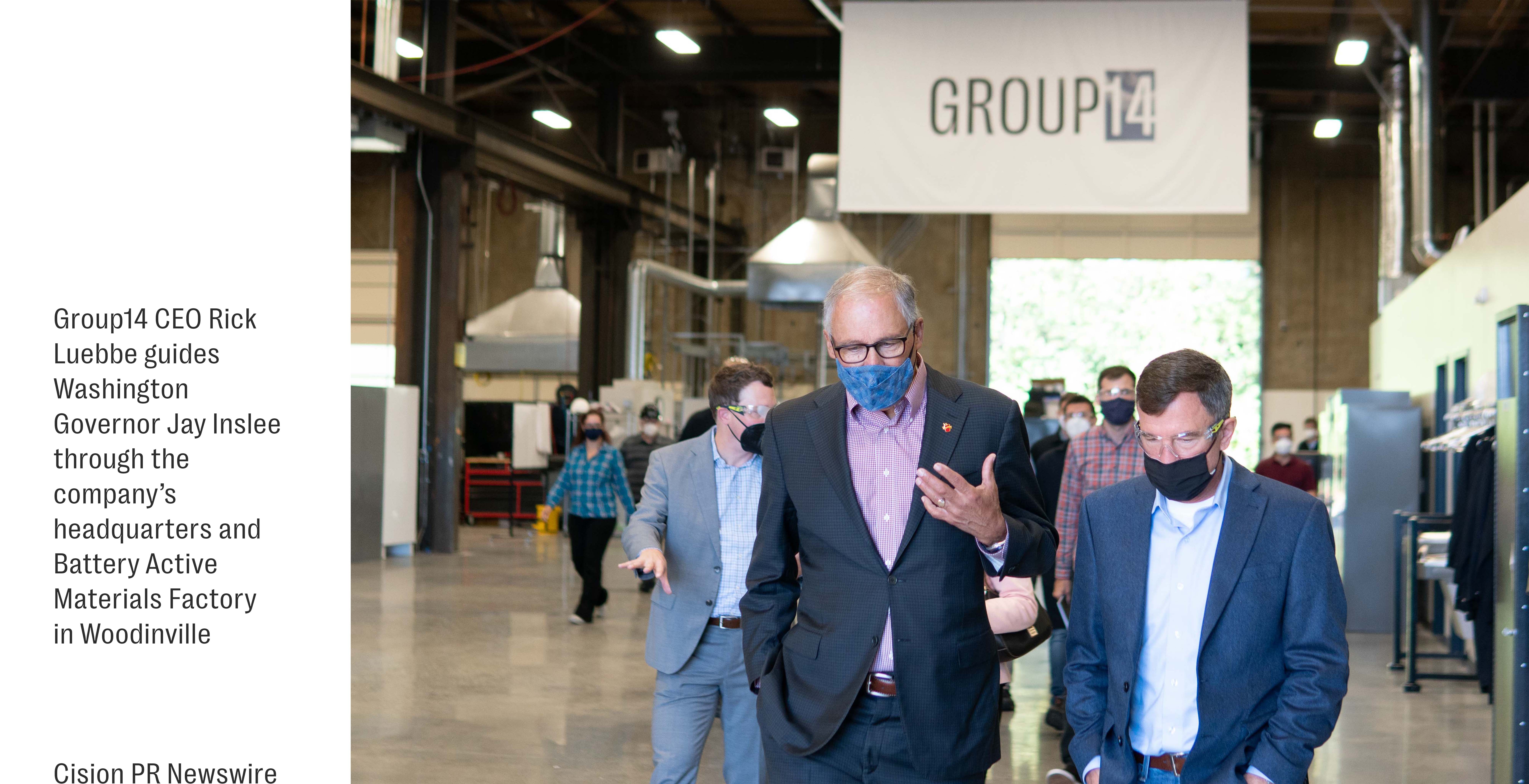
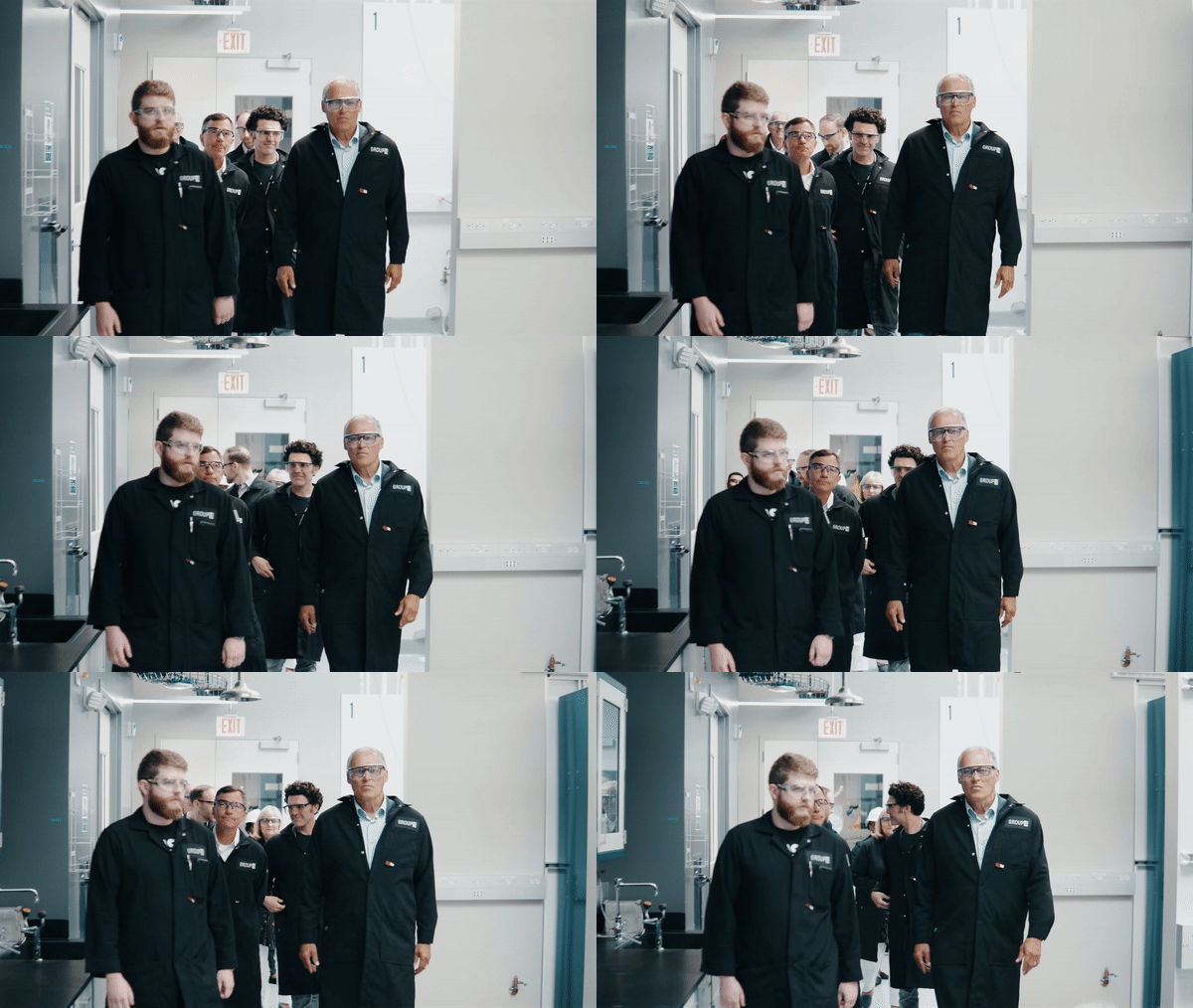
On multiple visits by Governor Jay Inslee to Group14 I was tasked with capturing photos and videos, documenting the visit for social media and press. All approved video content I developed for Group14 was compiled into a press kit.
Storyboard & Video
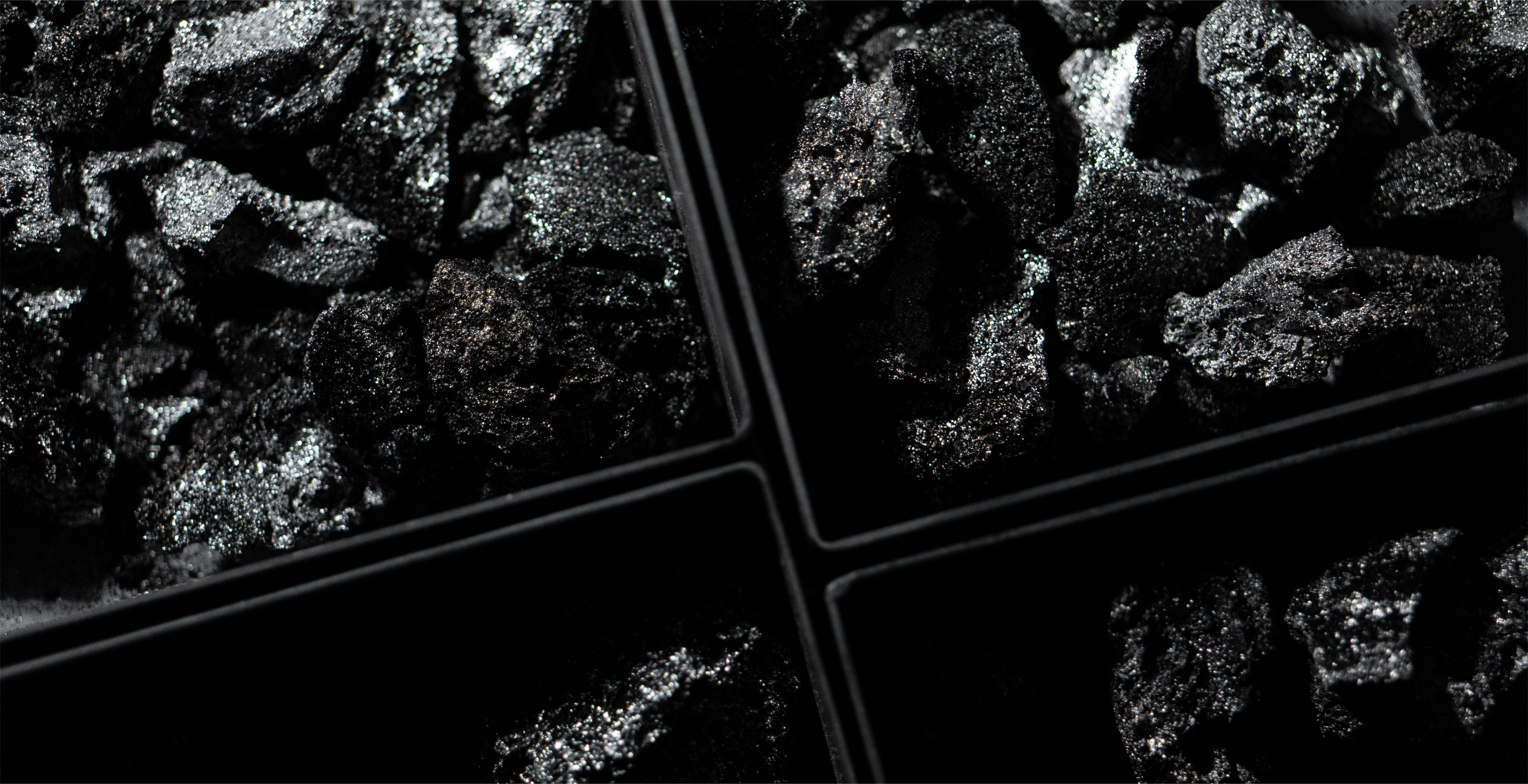
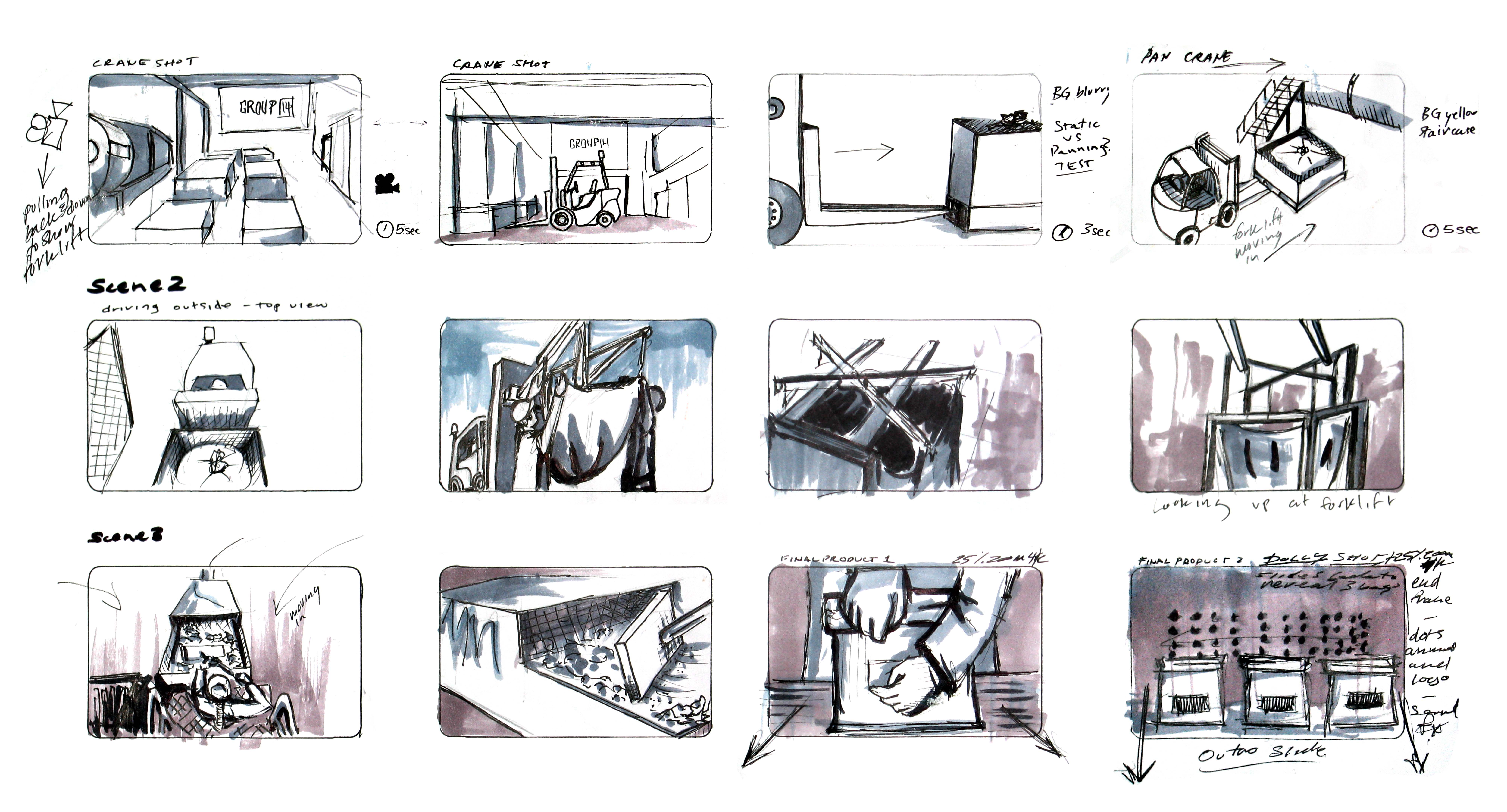
I was tasked with creating a video of the Battery Active Material process - it had to hide a few proprietary steps and be visually engaging to retain viewership. To begin I storyboarded the scenes: multiple people were going to be involved and that meant workers leaving the floor so I had to know ahead of time what role everyone had to avoid wasting time. The locations had to be approved and prepared so each shot was roughly accounted for beforehand in the storyboard. Creating quick concept sketches of the video allowed transparency in the process, and sped up the process of capturing footage and editing.
Talking Head Video
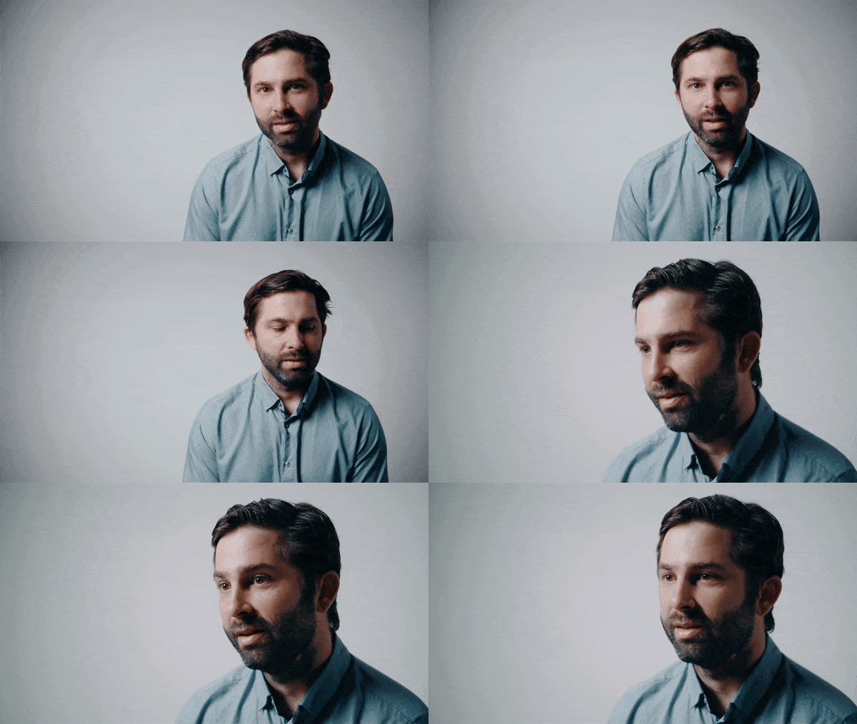
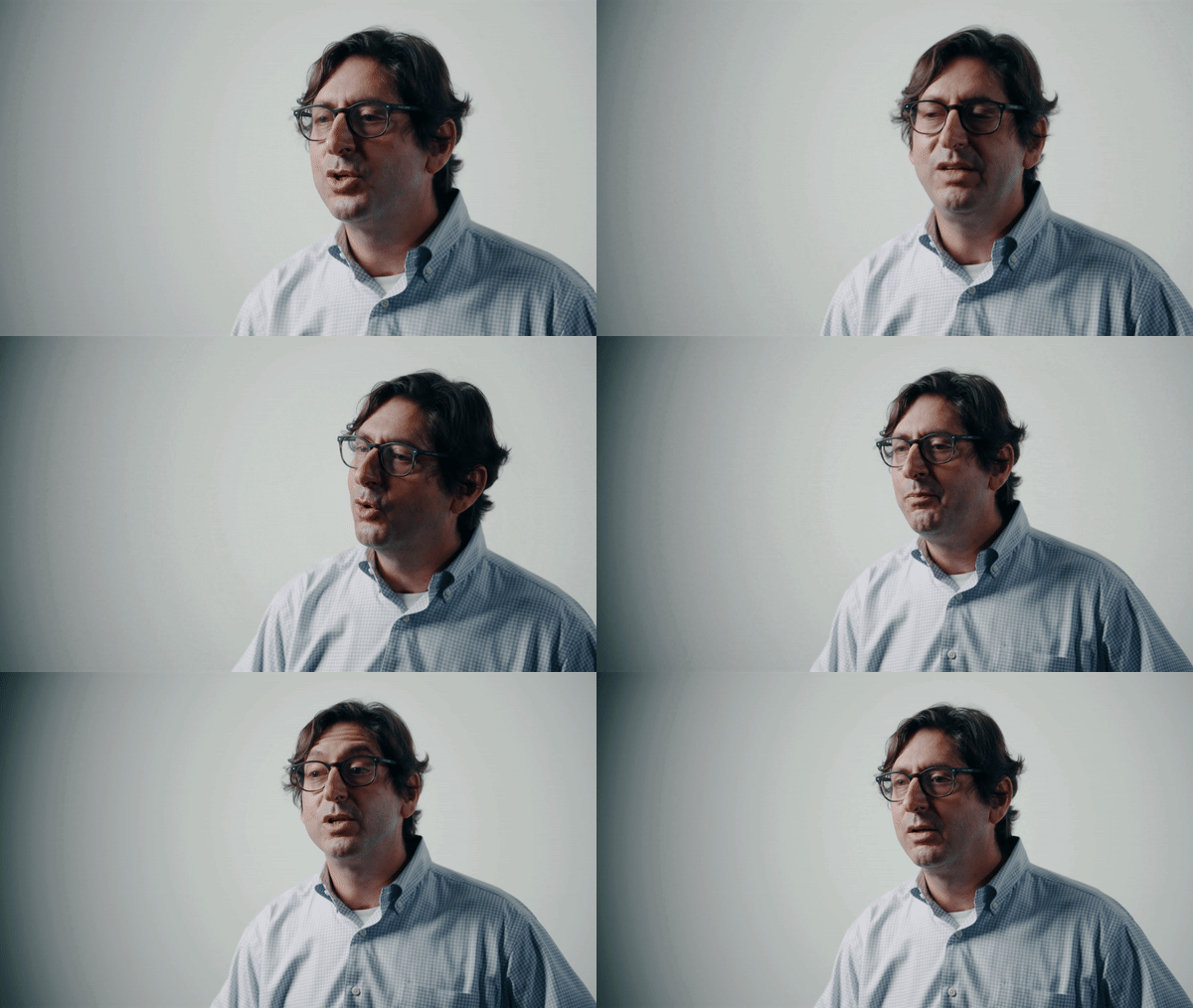
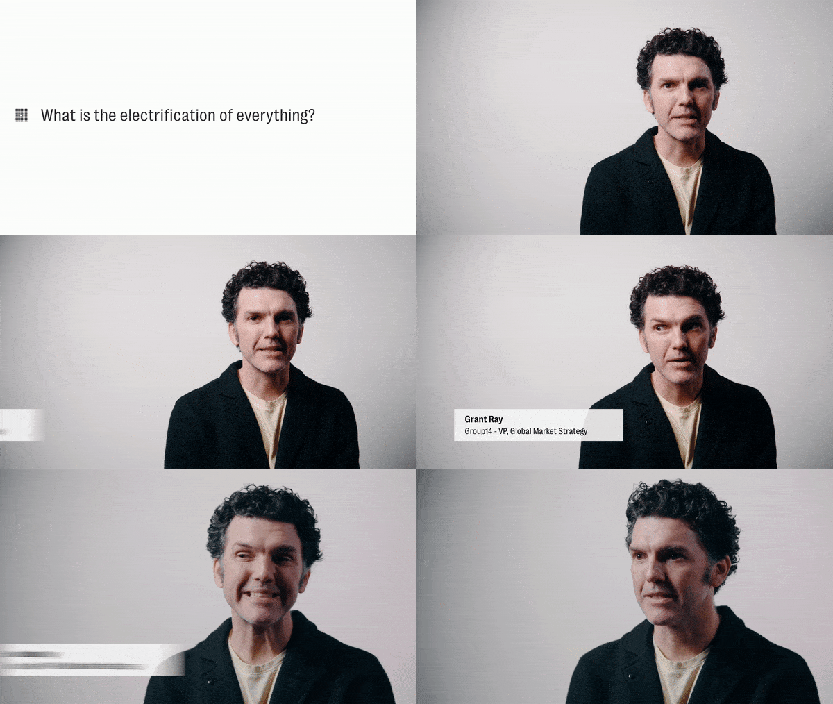
Creating the talking head video took a lot of planning and gear prepping. I managed the setup of the cameras, mics, lights, and post production. The execs were being recorded on lav mic and boom mic, with 2-3 cameras in each video.
That then moved into a process of file management, picking selects, editing and reviewing the clips. After all the select clips were synced with audio it was cut and color graded.
I advised the team on Youtube strategy, provided brand assets, and thumbnails for starting the Group14 page. The videos are published on Youtube, used in email marketing campaigns, social media campaigns, and more.




Limeade
Whitepapers
One-Pagers
E-Books
Illustration
Patterns
Concept Design
Brand Guidelines
Social Media Strategy
Video
Photo
About
Limeade is a SaaS company based out of Bellevue, WA. Boasting an extensive clientel and award winning solutions to employee well-being they are striving towards a better work environment for everyone.
American Airlines
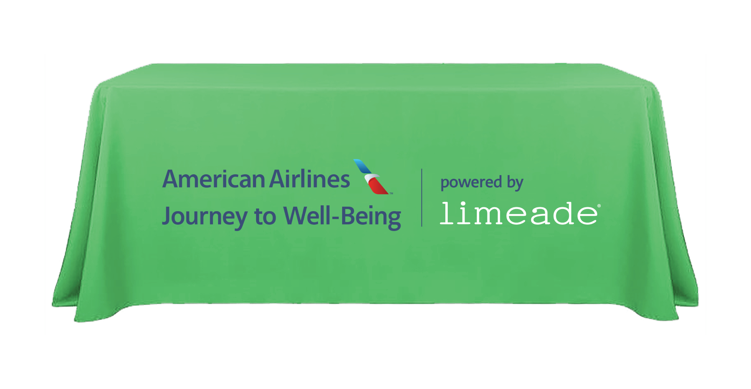
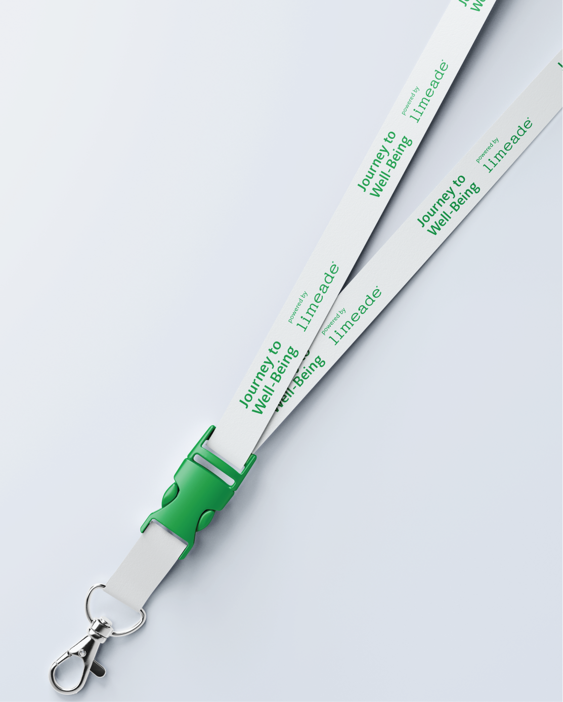
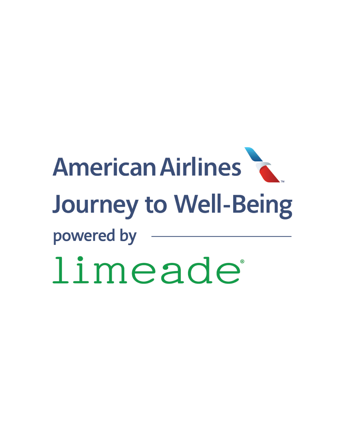
The American Airlines Journey to Well-Being program included a physical event component which needed to be co-branded. I was tasked with designing logo lock-ups in vertical and horizontal orientations, along with various mock-ups for the requested applications.
The project guidelines were limited to the brand guidelines provided by American Airlines and Limeade. With this ambiguity I took initiative to design a logo that perfectly blended the two brands, and showcased it on multiple mockups (as it was made to be used on swag and print)
Video
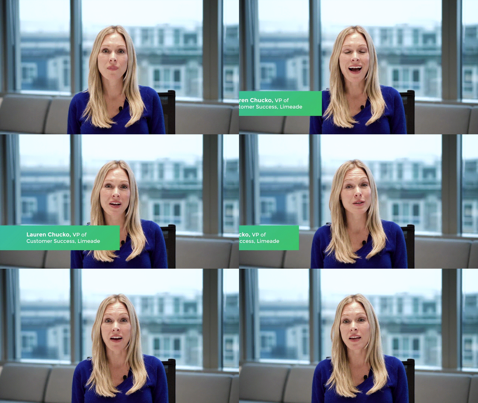
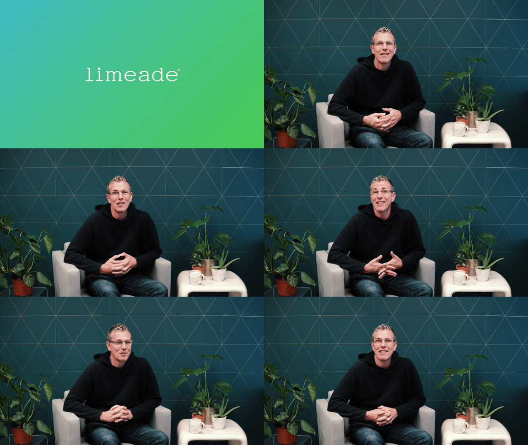
Videos produced for Limeade varied from internal communications to personal client messages from Henry Albrecht (CEO of Limeade) as displayed on the right with a video message to the team at Disney (a potential Limeade client). My expertise in video production was utilized monthly; wherein I set up my video equipement, hooked up audio monitoring and recording devices, captured video, post-processed the footage, and delivered in multiple file sizes to the corresponding team.
COVID-19
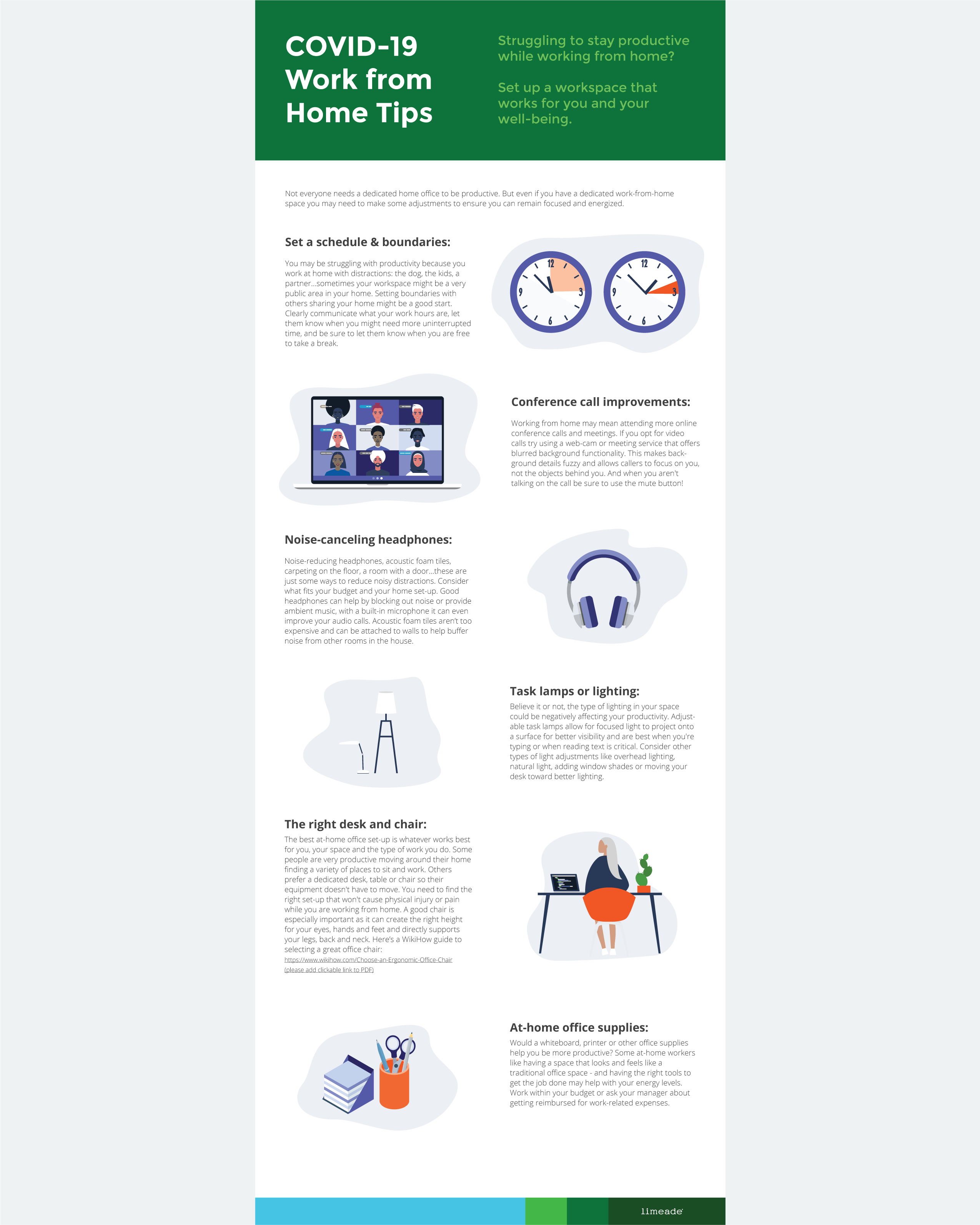
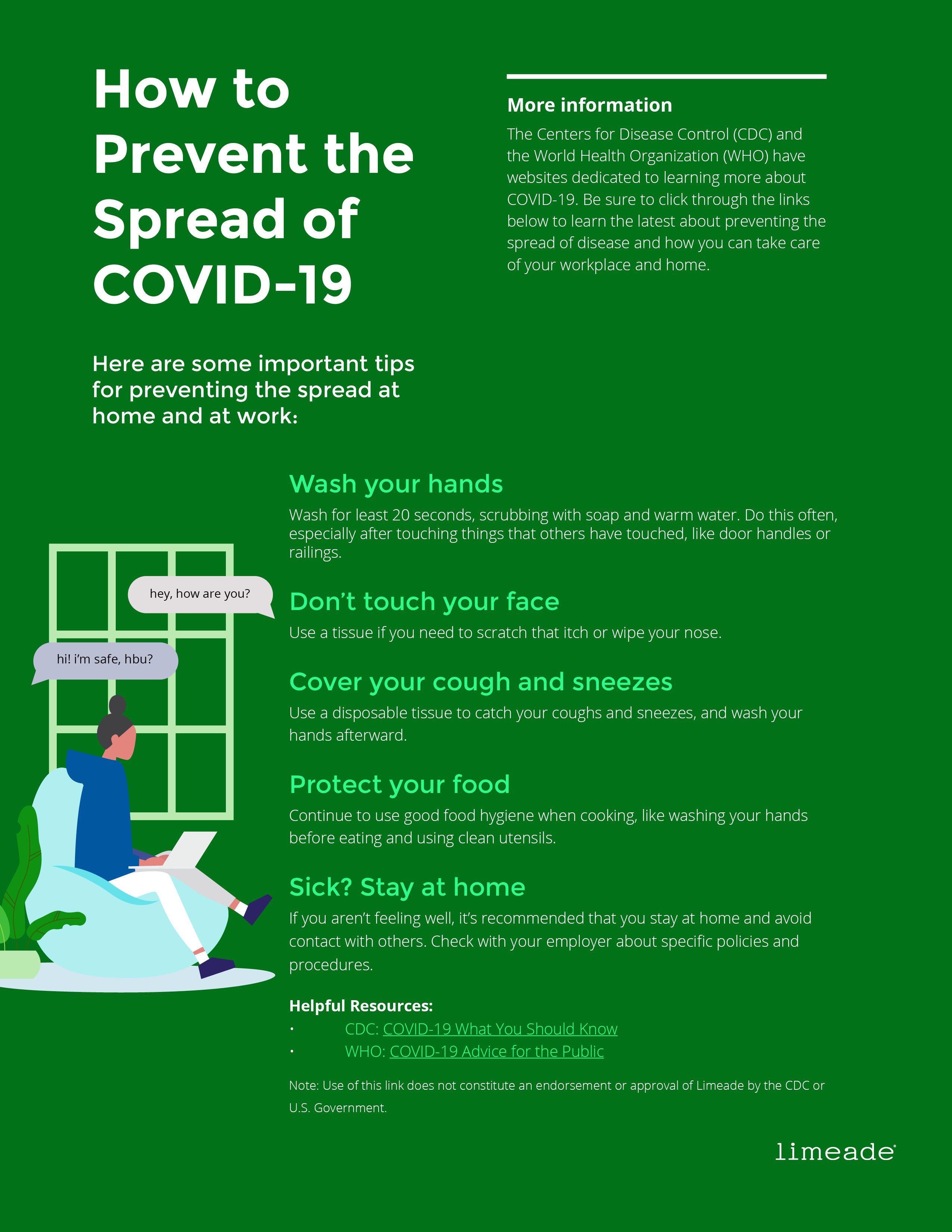
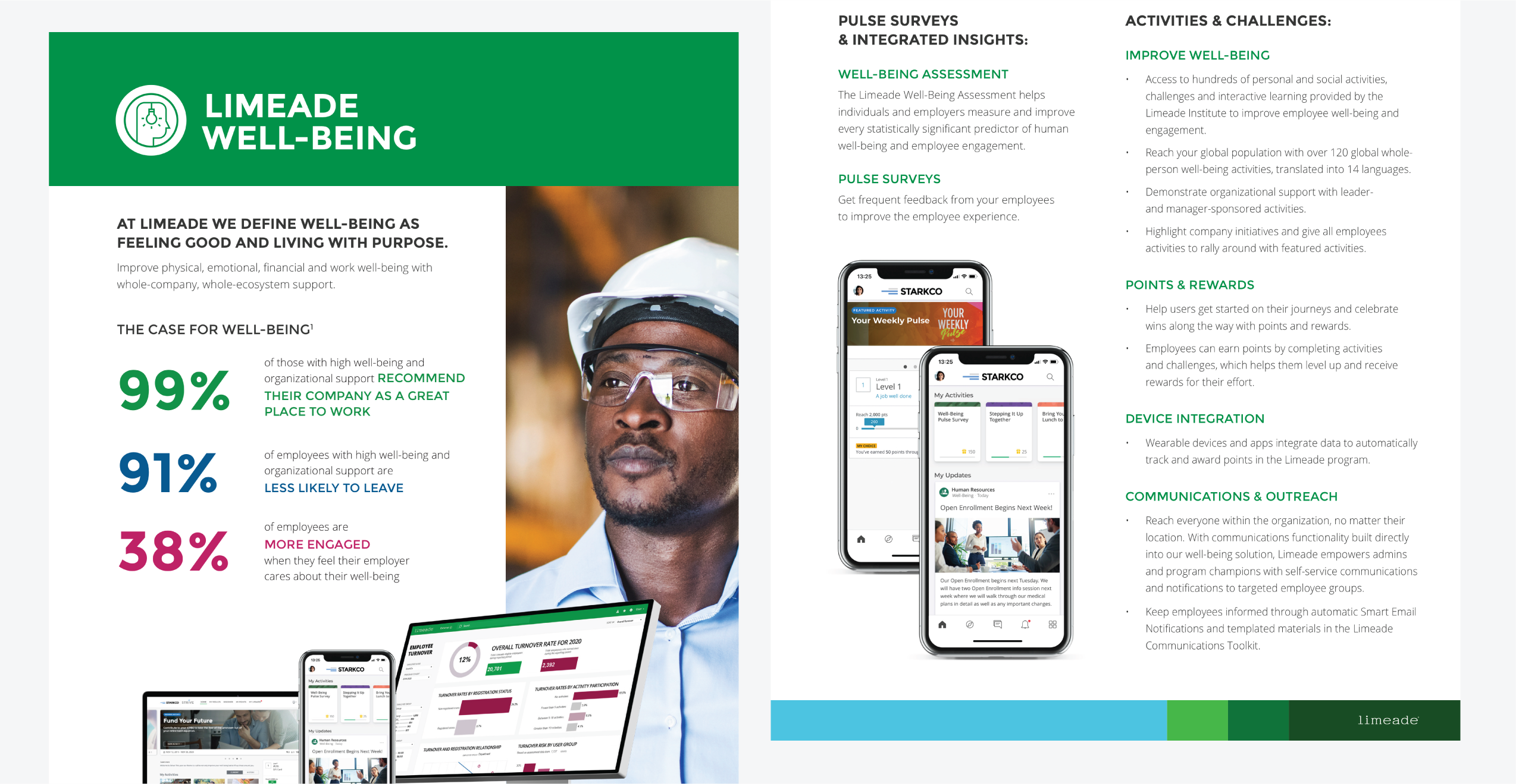
In response to the COVID-19 crisis the care card was designed as a way to interact with neighbors while social distancing. In addition to the care card multiple infographics were developed to support working from home and helping prevent the spread of the virus.
Honda
The Honda program was being refreshed and I was tasked with curating photography (due to my role on the Limeade photography guide).
Bosch
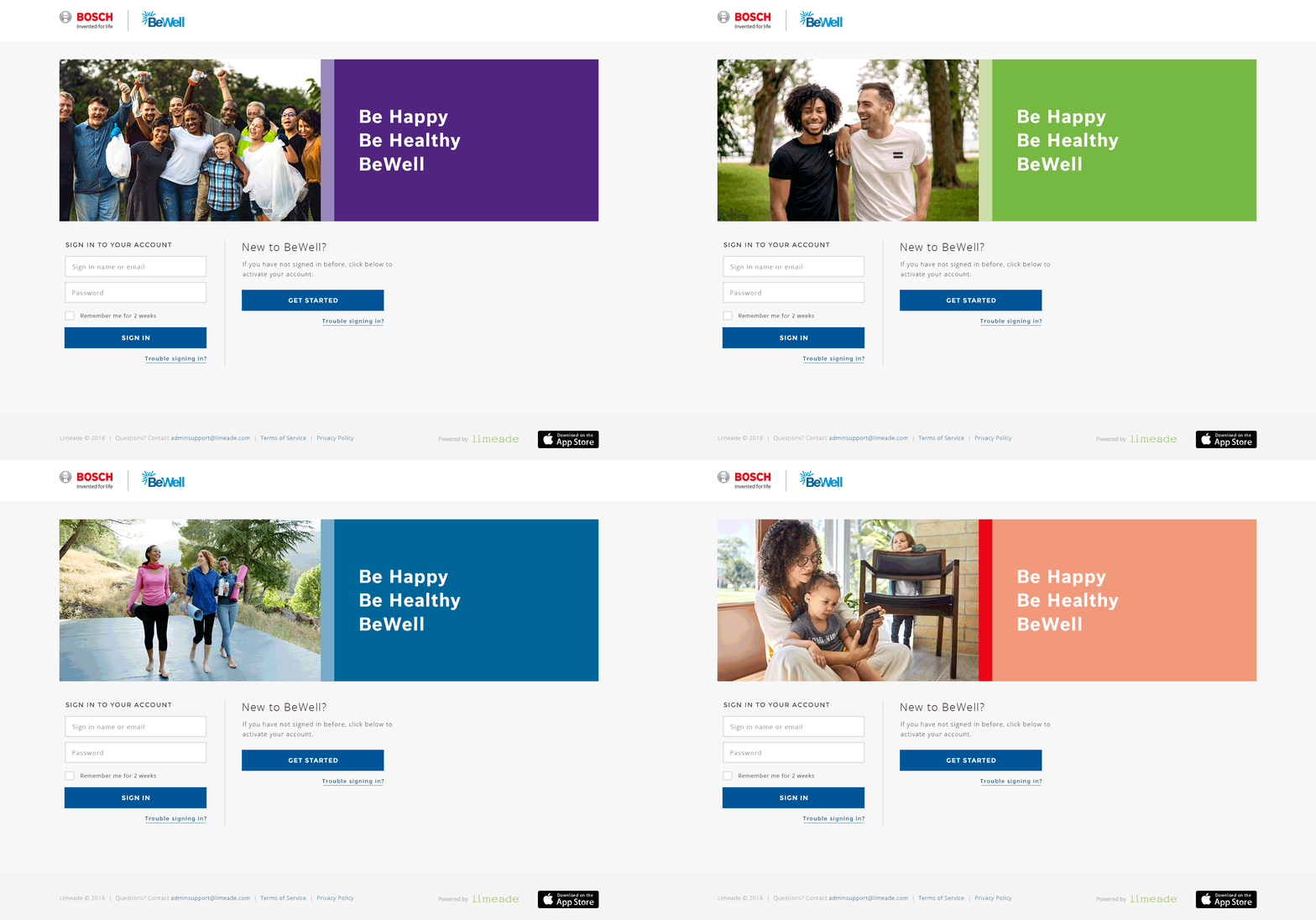
The Bosch BeWell program consisted of designing a moving banner and curating photography.
Genesis
One of my personal favorites was the mock program “Genesis Live Well” wherein I developed a logo (Genesis), a program logo (Live Well), created a moving banner, and curated photography.
Press
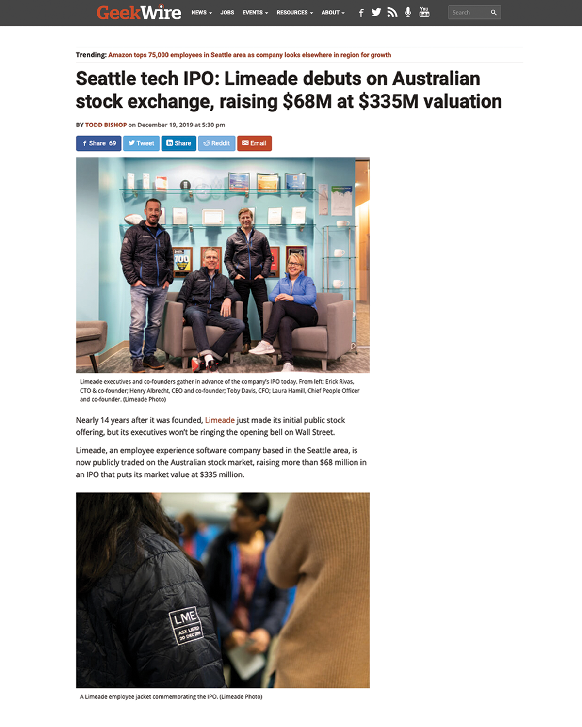
In my time at Limeade the company debut on the ASX. I was tasked with taking photos which were used for press releases, such as this example from GeekWire.com
Iconography
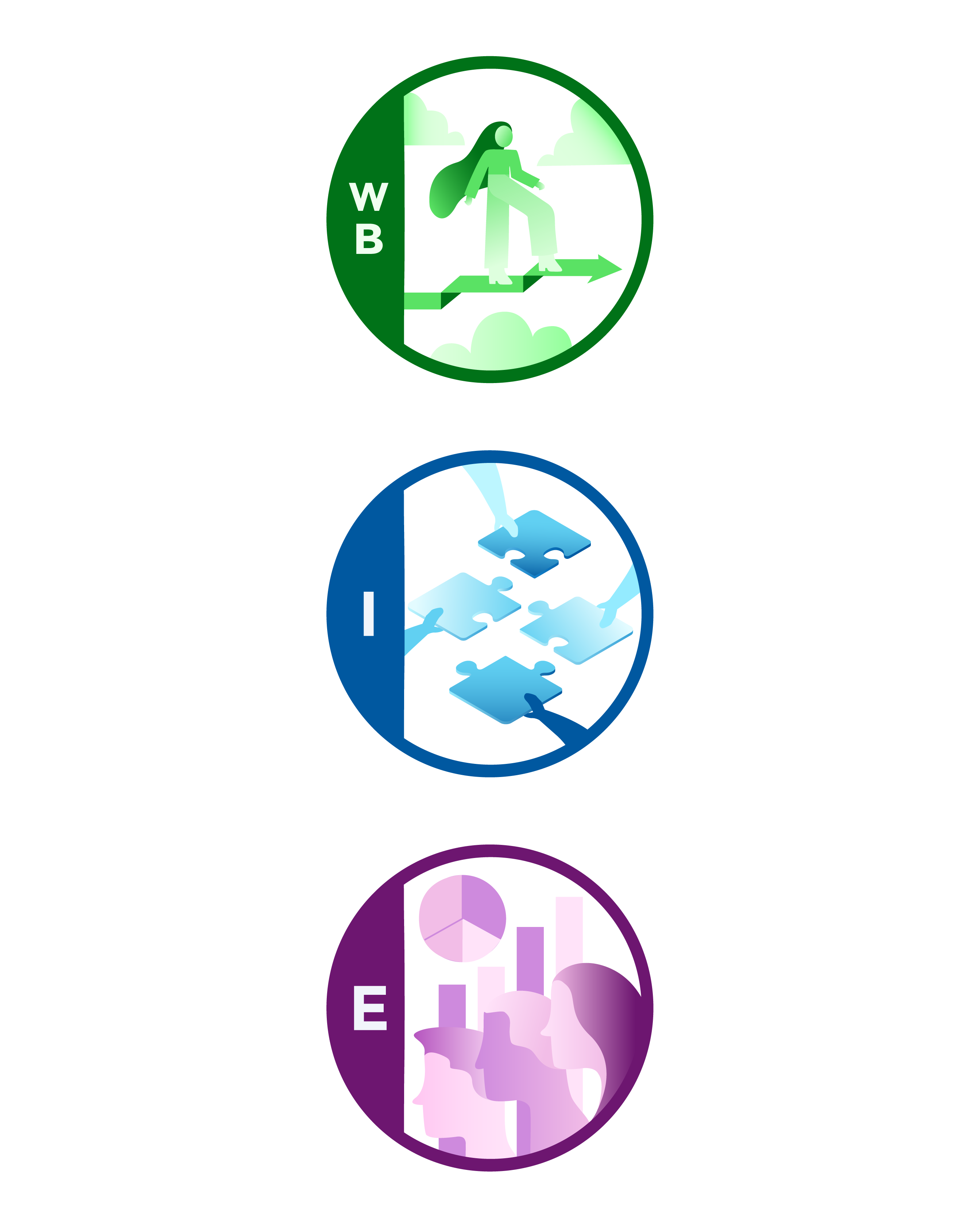
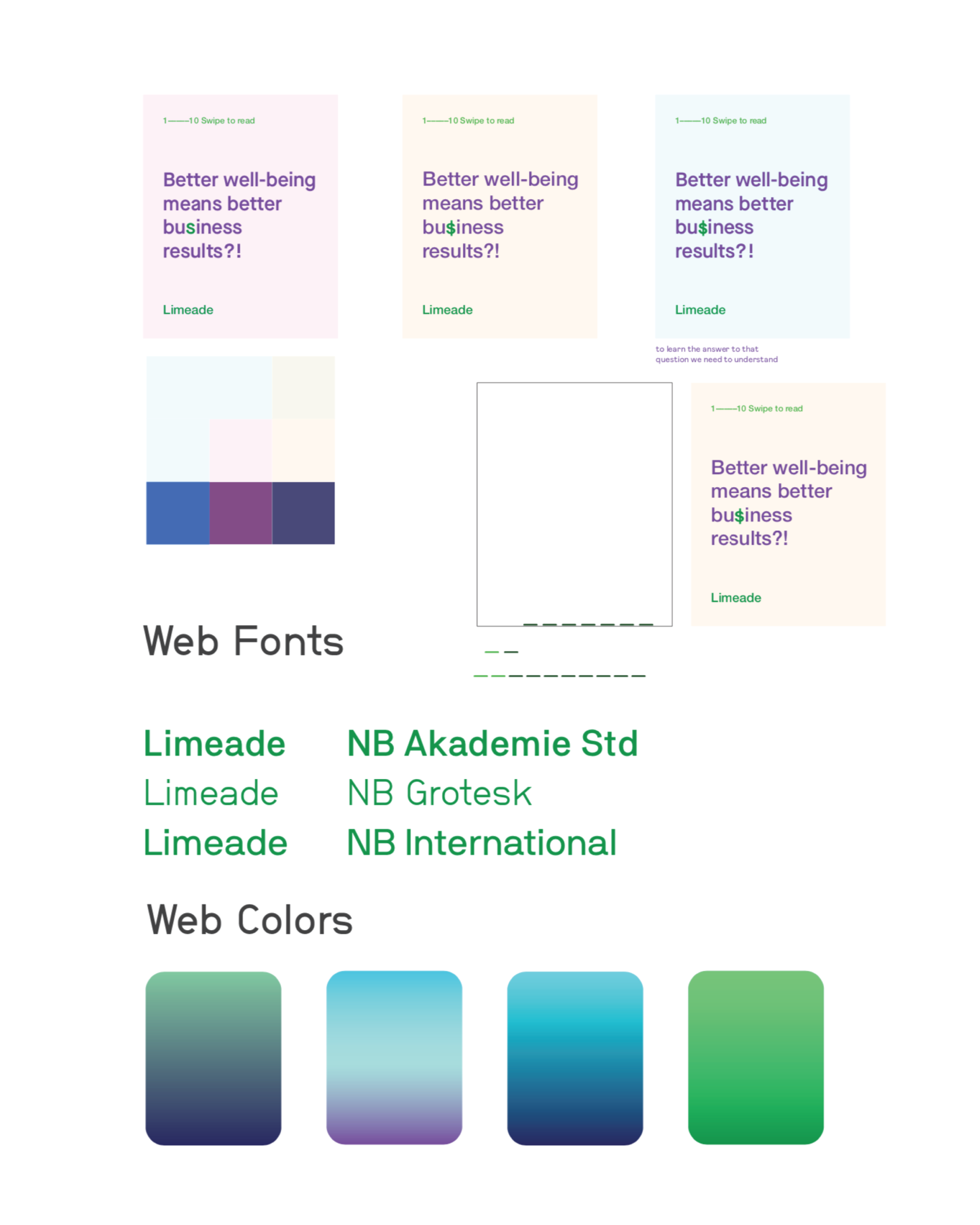
Icon exploration for Limeade’s offerings Wellbeing, Inclusion, and Engagement was assigned by my Art Director to assist him in the Limeade brand refresh work.
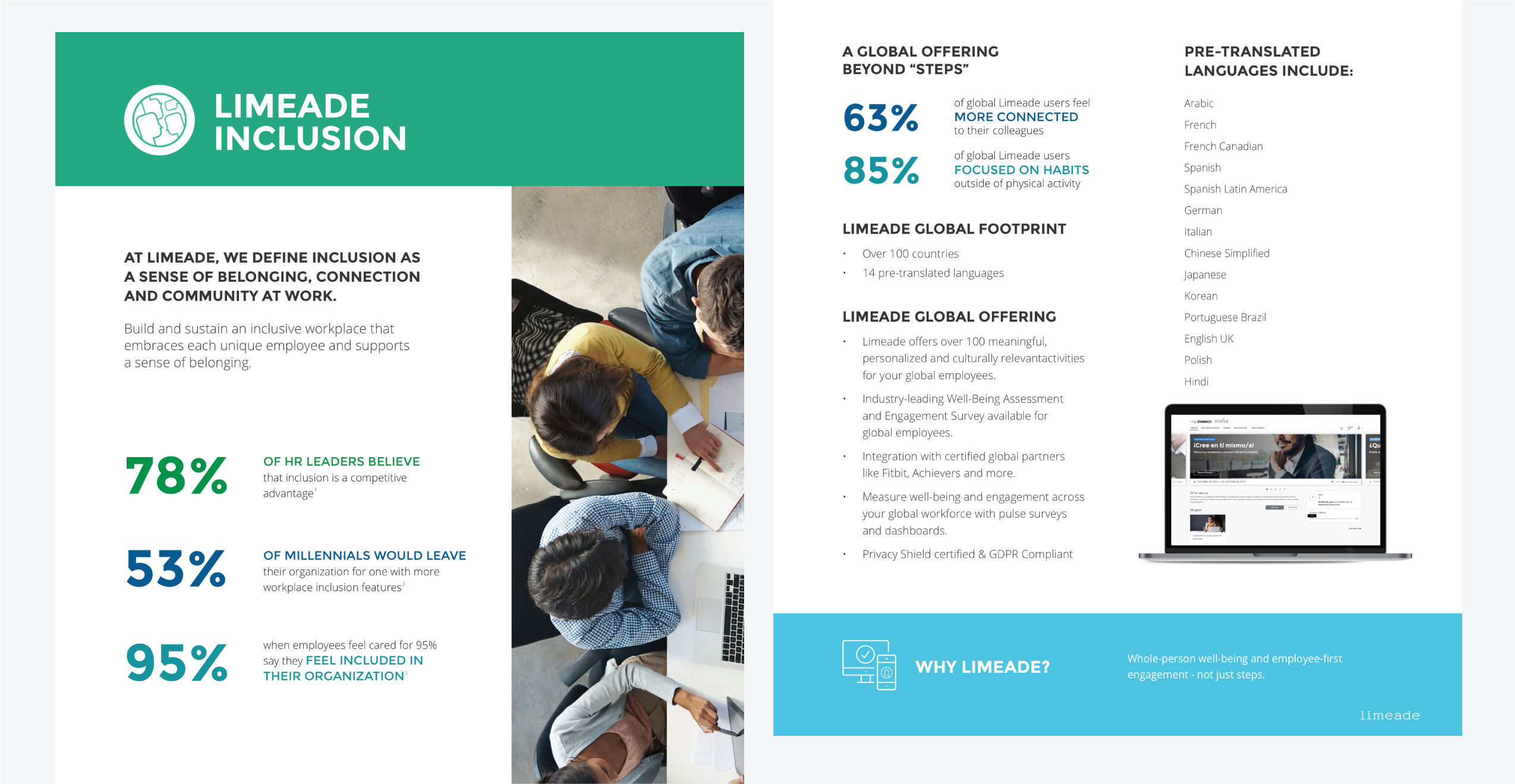
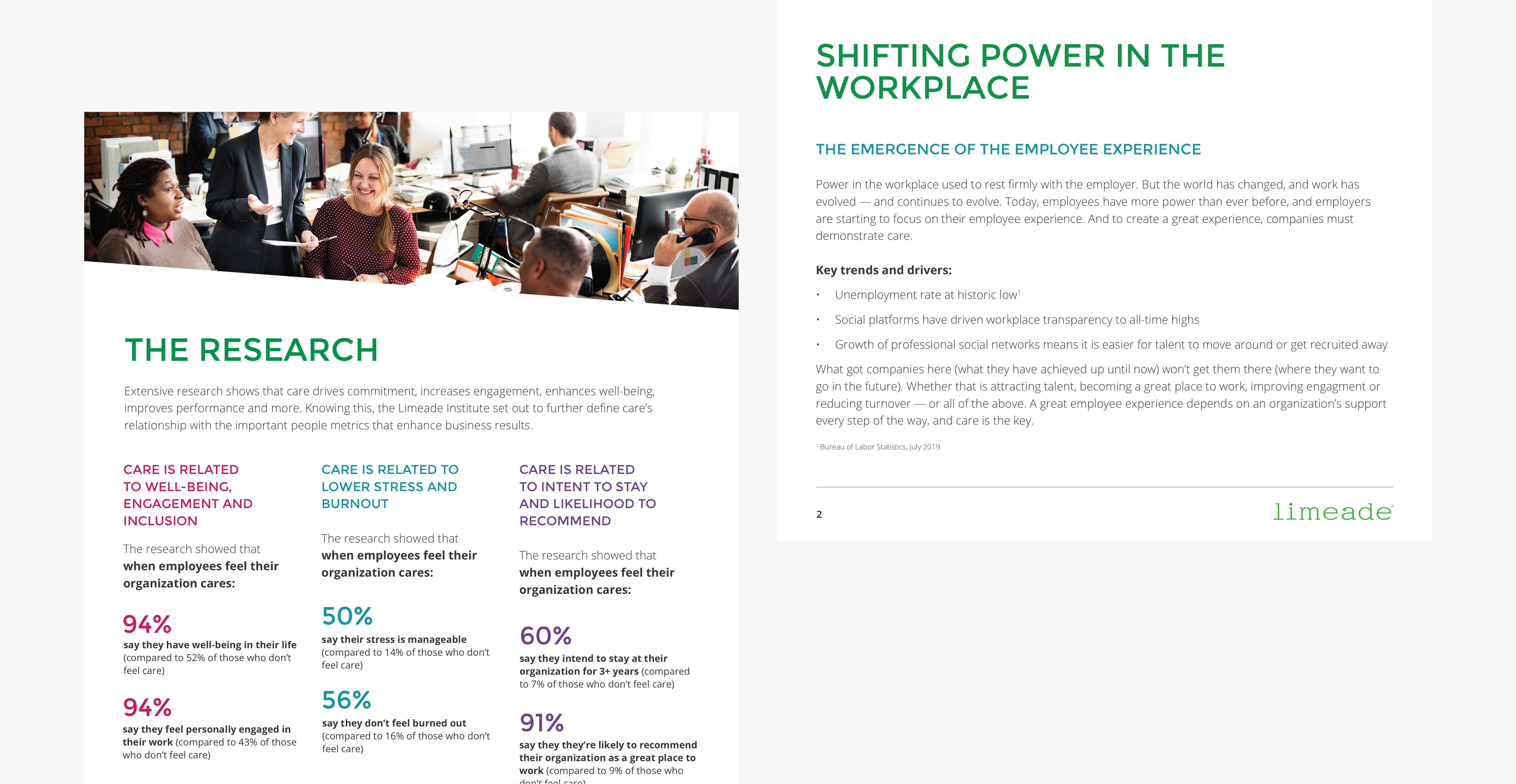
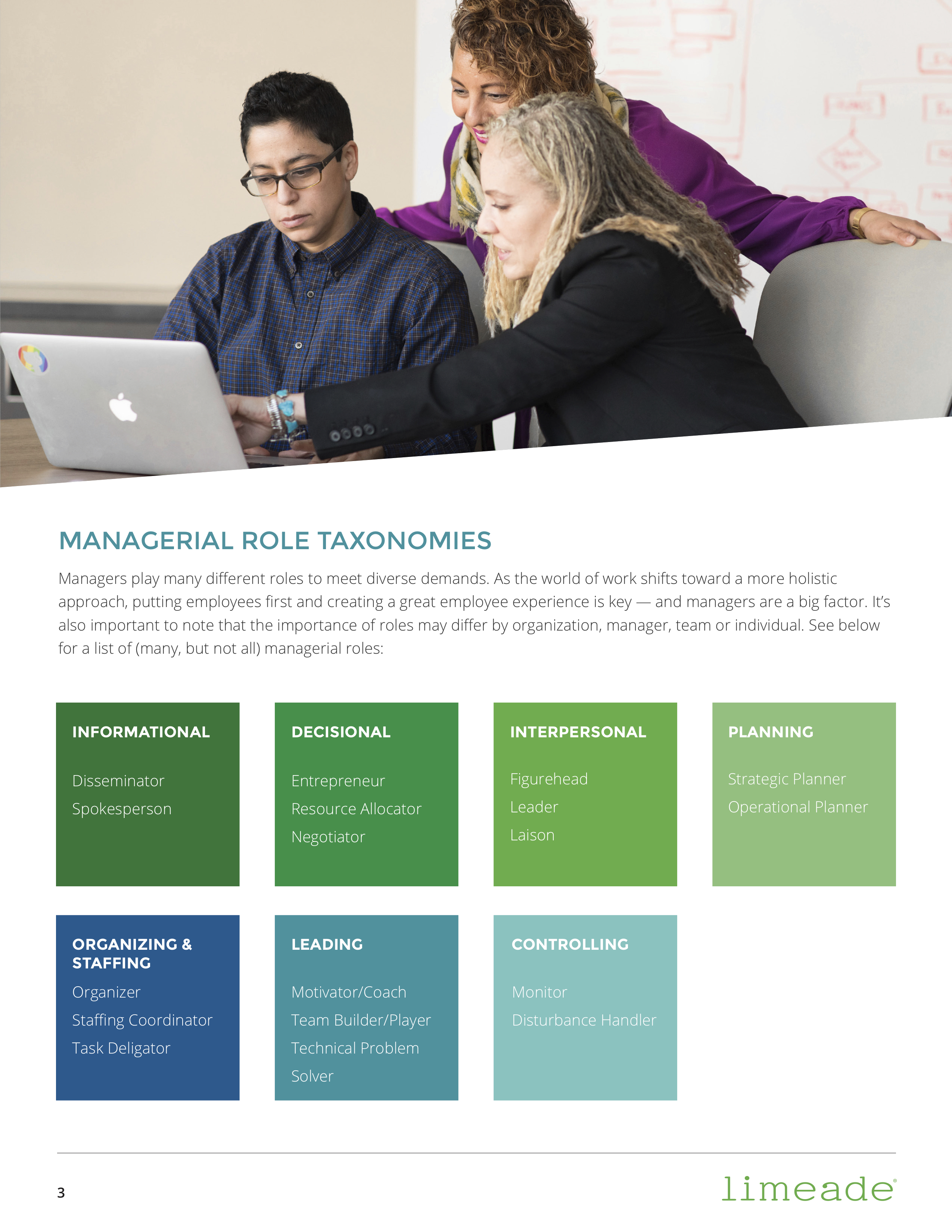
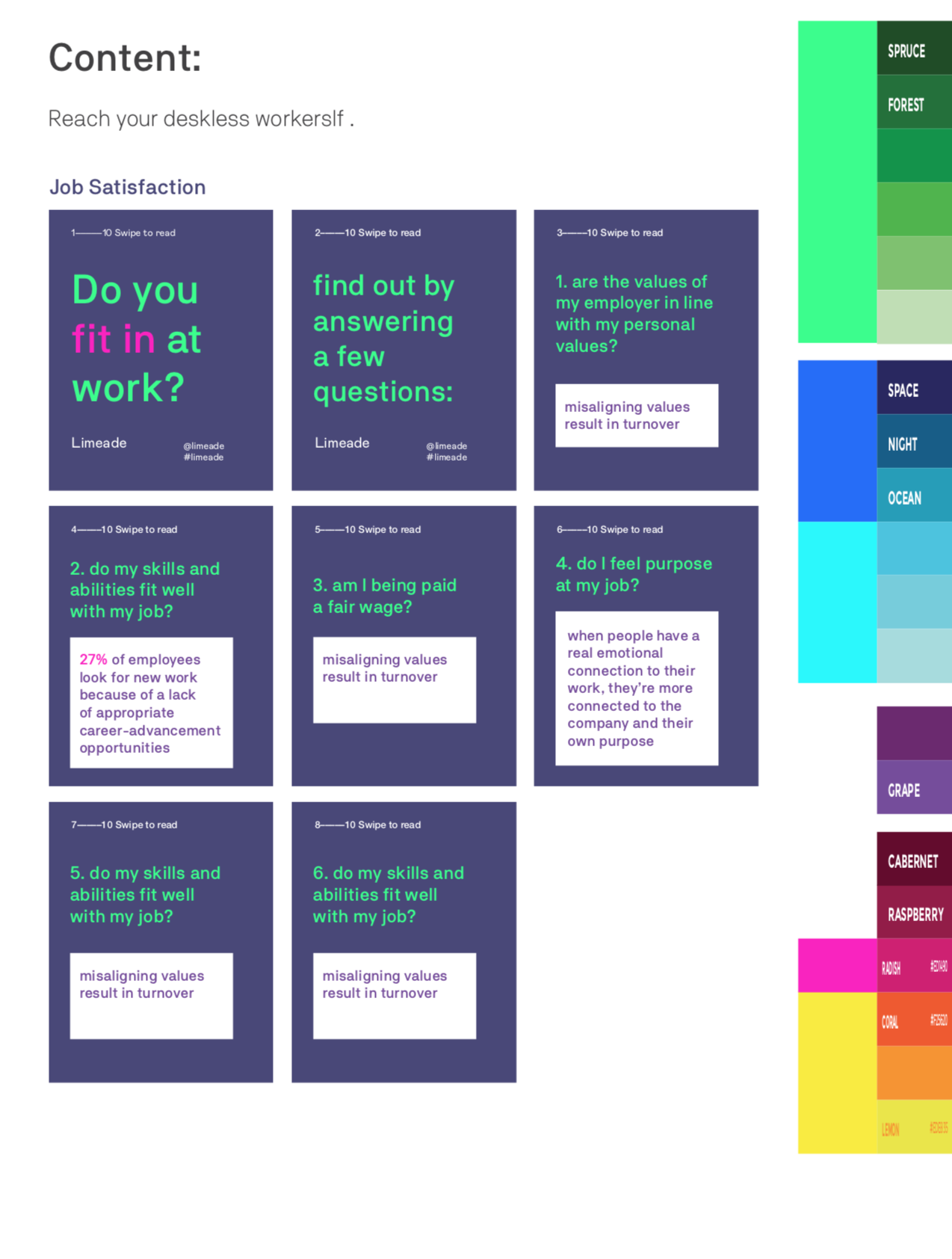
E-Books, Whitepapers, and One-Pagers were heavy on layout and data visualization. Included are some of my pages showing the general focus of the content.
Conference Design
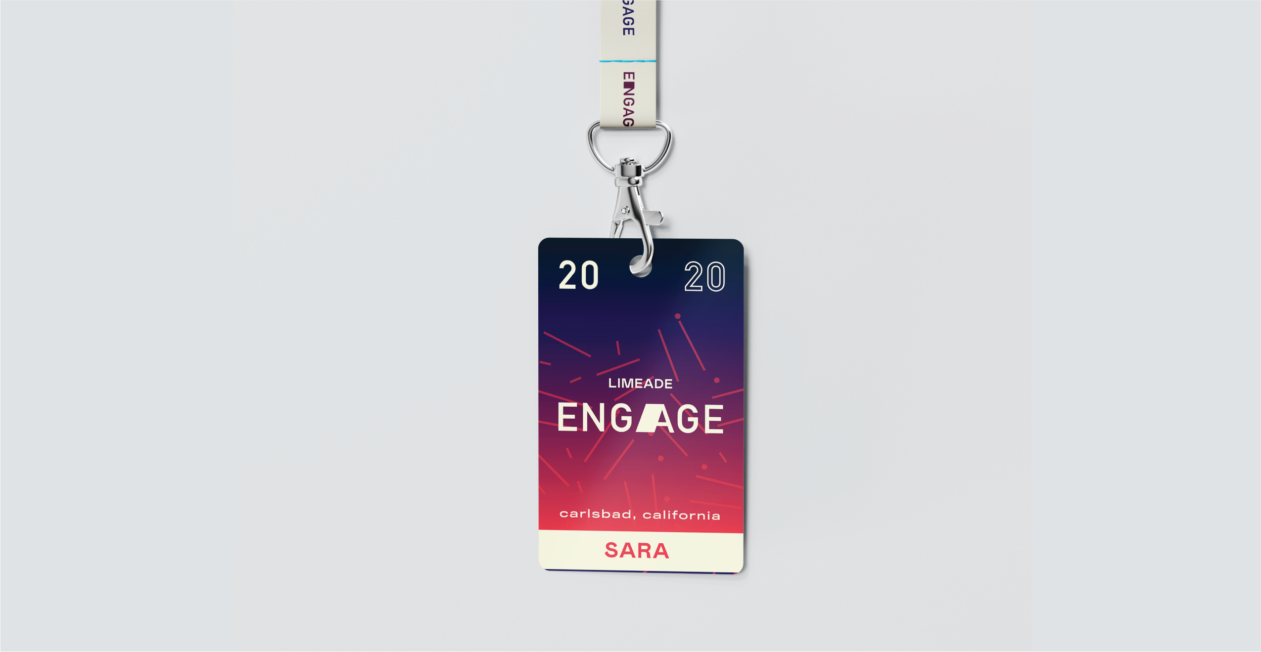
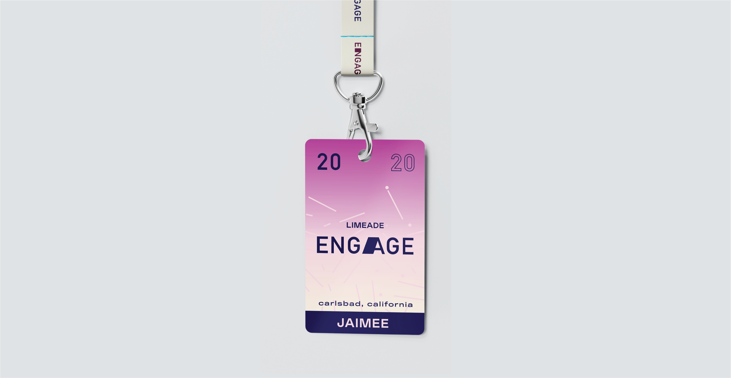
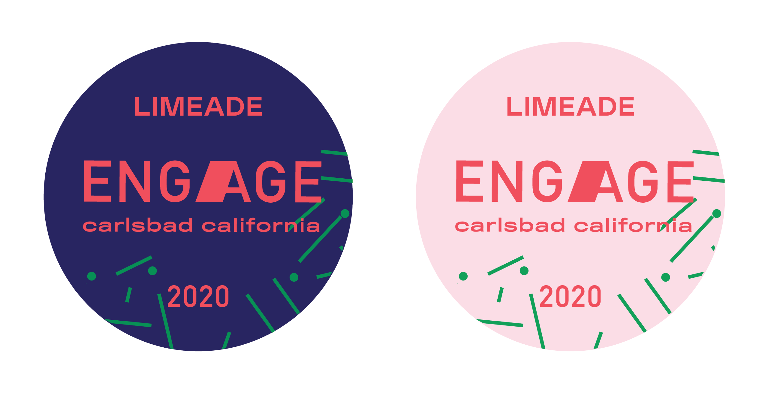
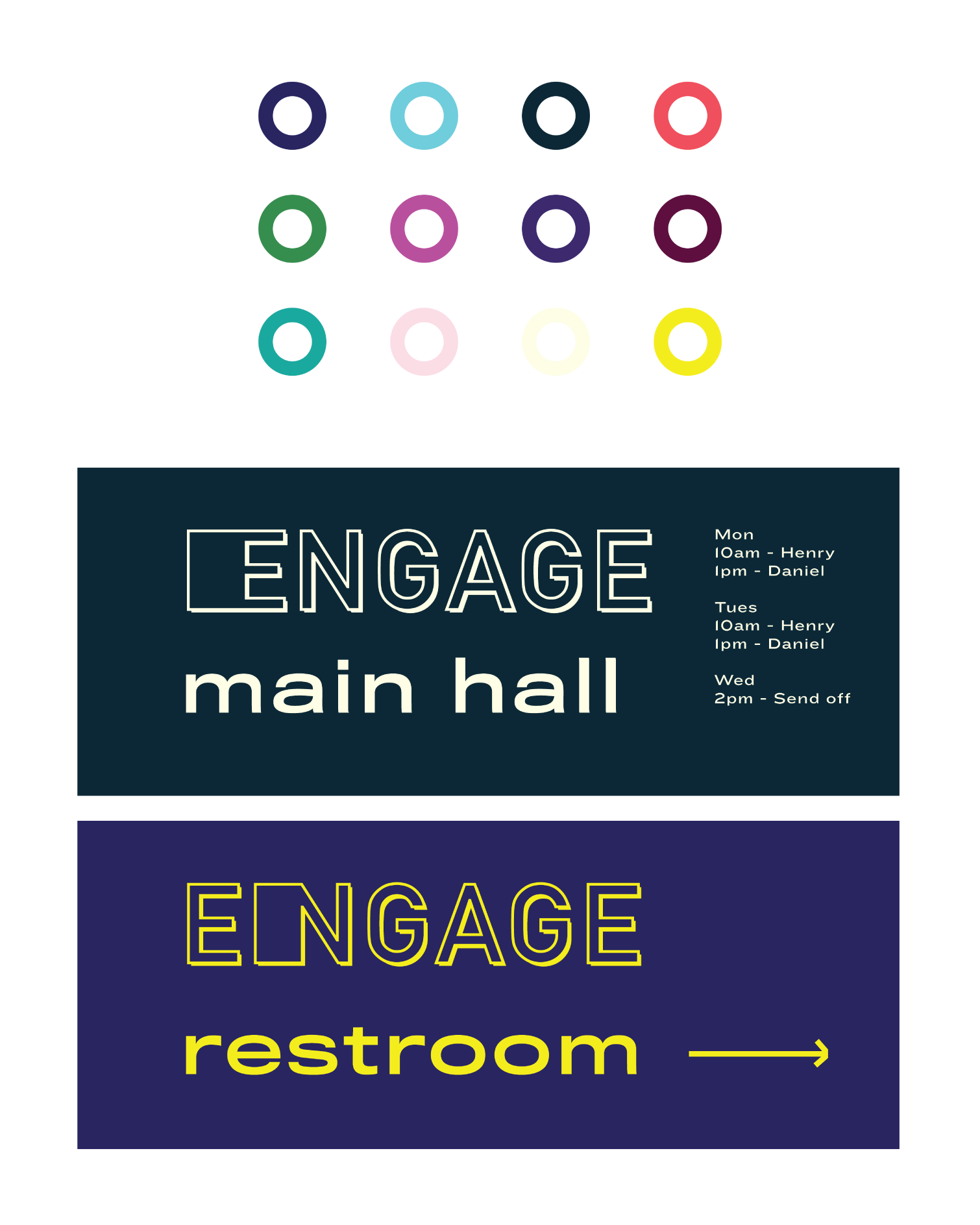
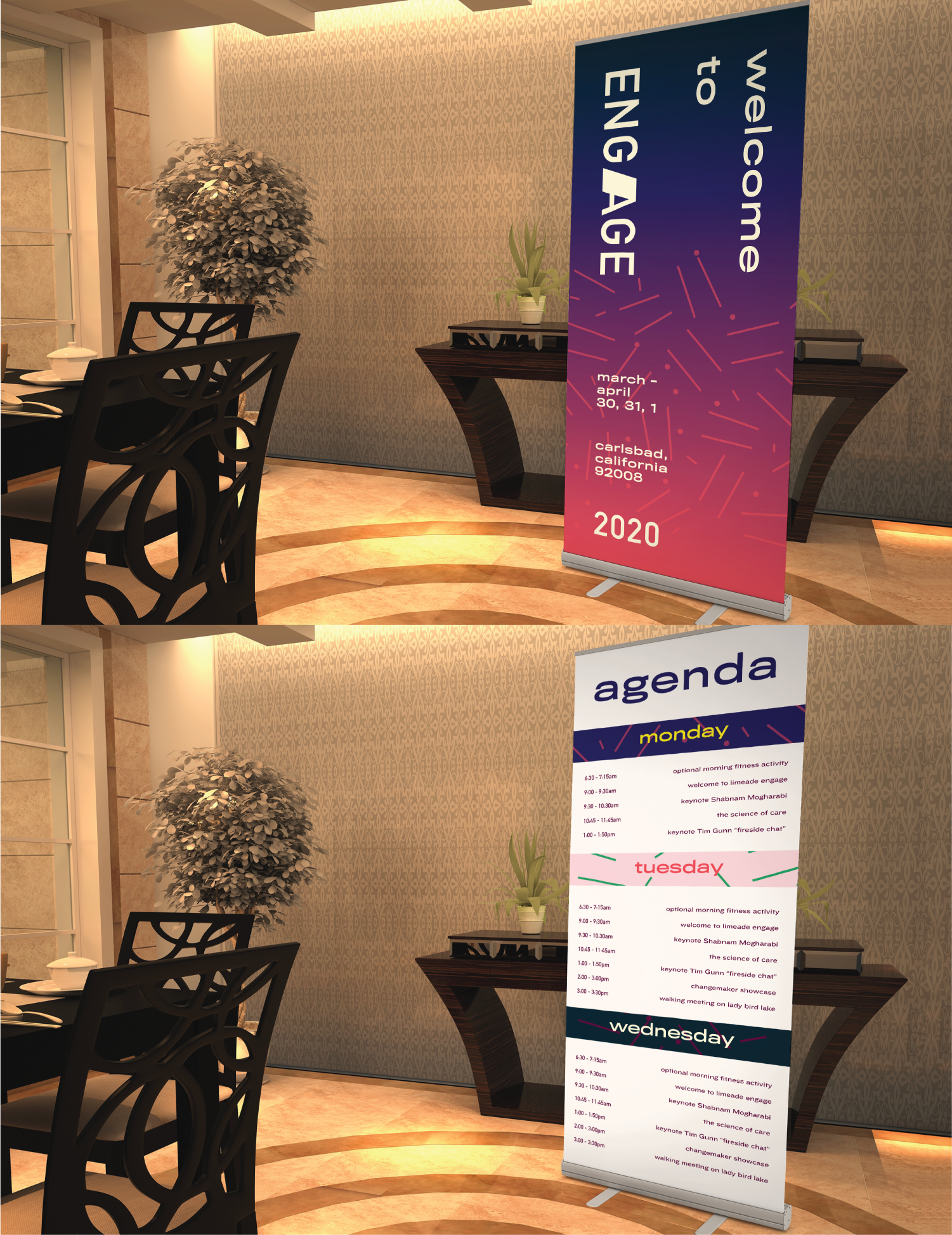
Limeade holds a yearly conference named “Engage” for clients/potential clients to attend. Multiple designers were tasked with creating their own conference branding pitch that stretched the Limeade brand (as a way to experiment with aesthetics without implementing any permanent changes).
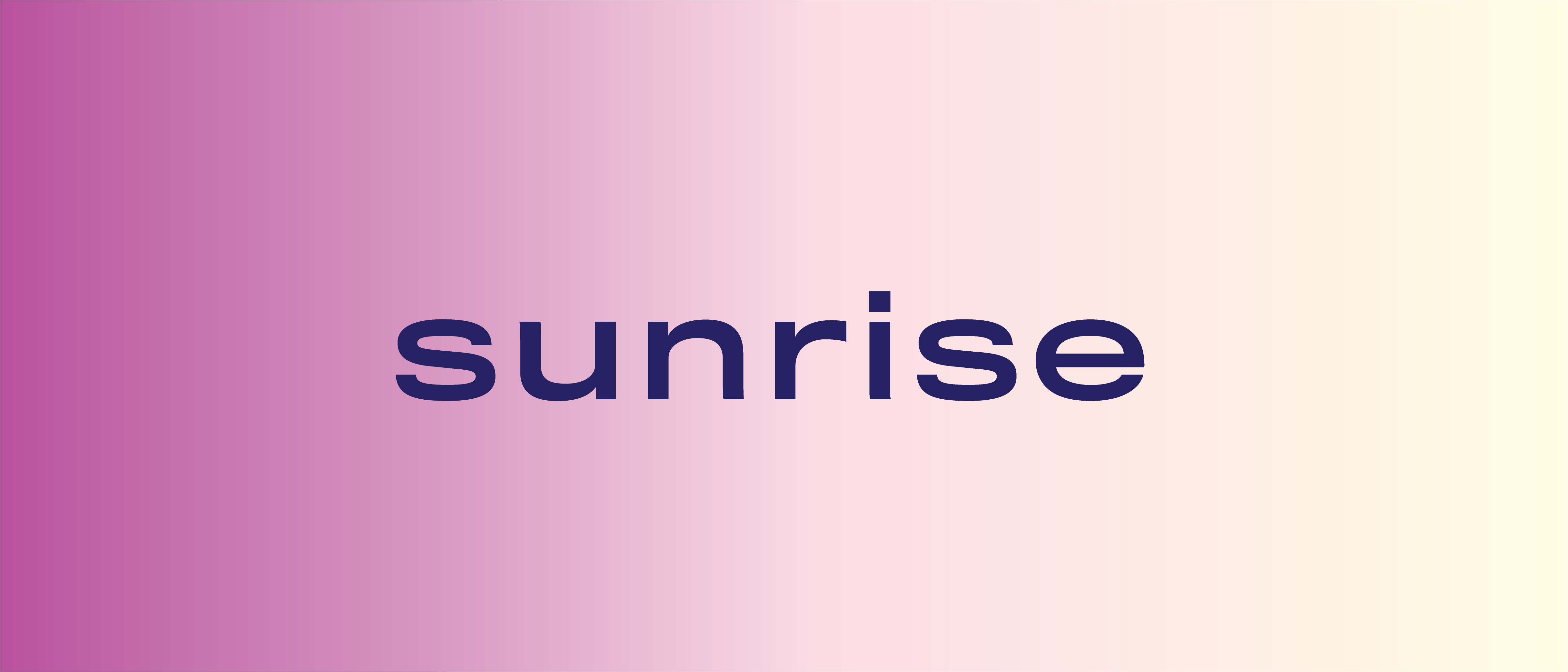
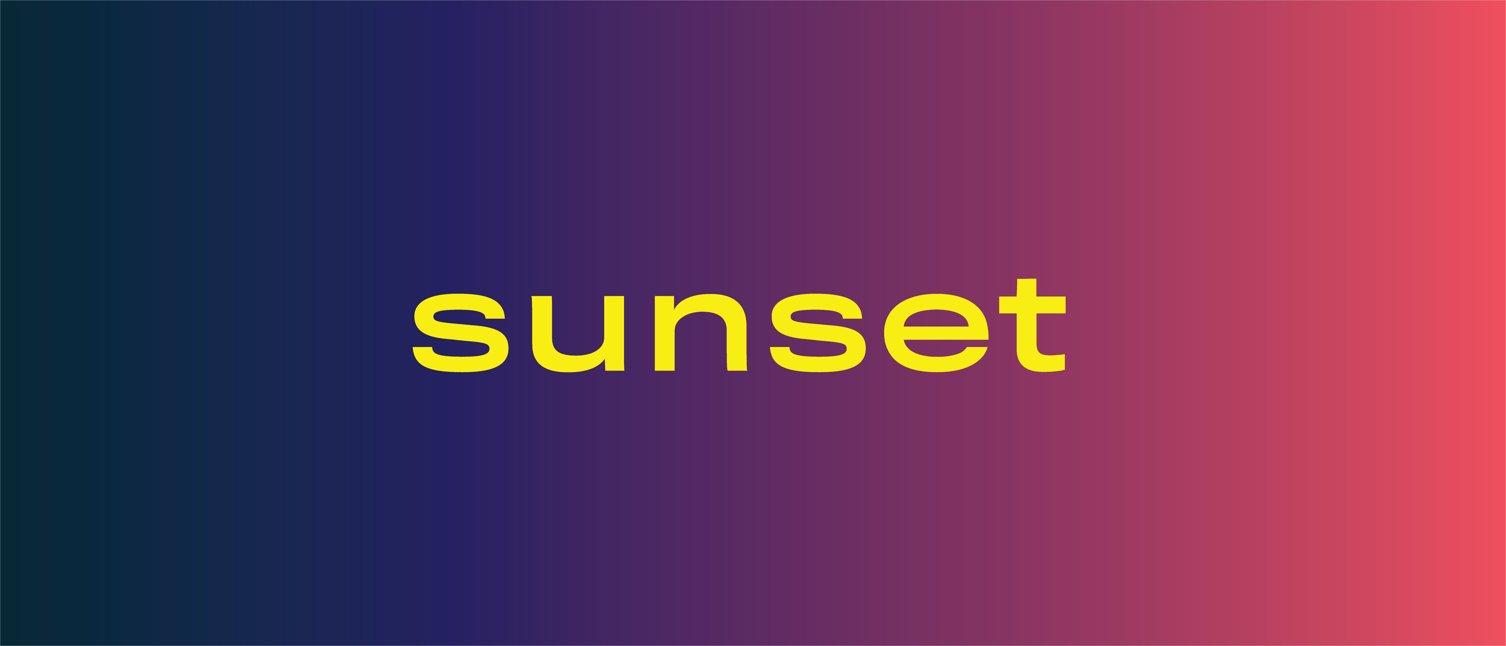
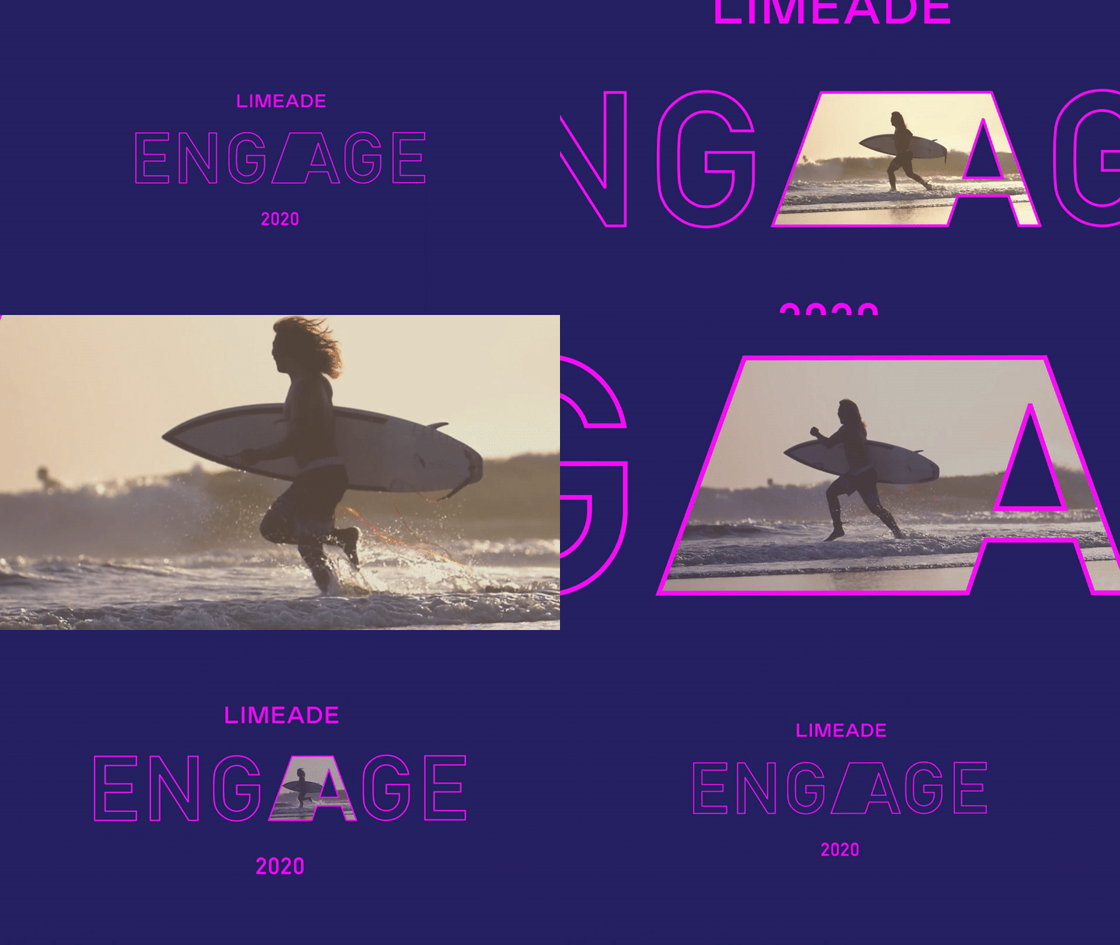
My pitch was built around the concept that branding can engage with the viewer. The two dimensions that my branding fills are sunrise and sunset, the color palette reflects this, featuring colors one encounters at a beach sunrise/sunset. The animation I developed for the logo treats the letter “A” as a window into the location of the conference (Carlsbad, California), pulling the viewer in and out as a teaser. The rest of the branding stays light and fun natured, treating the logo as a variable font wherein certain letters are stretched. The primary logo keeps only the letter “A” stretched while secondary logos might feature any one of the letters inside engage as stretched.
Social Media Strategy
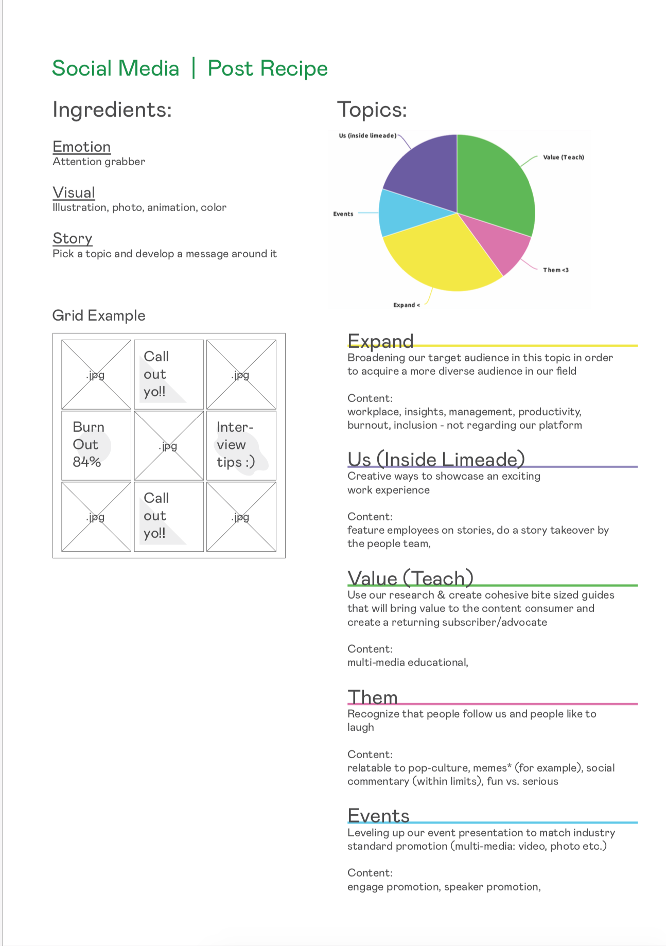
My social media content creation and posting strategy was created to assist the social media manager at Limeade with her and help develop a fast workflow. In my document I shared valuable data regarding social media algorithms and my knowledge about generating content to grow a niche following, which would help their brand awareness and create customers.









Zoka Coffee
Logo
Branding
Marketing
Illustration
Packaging
Social Media
Photo
Video
Credits
Website Dev: SeaMonster Studios
About
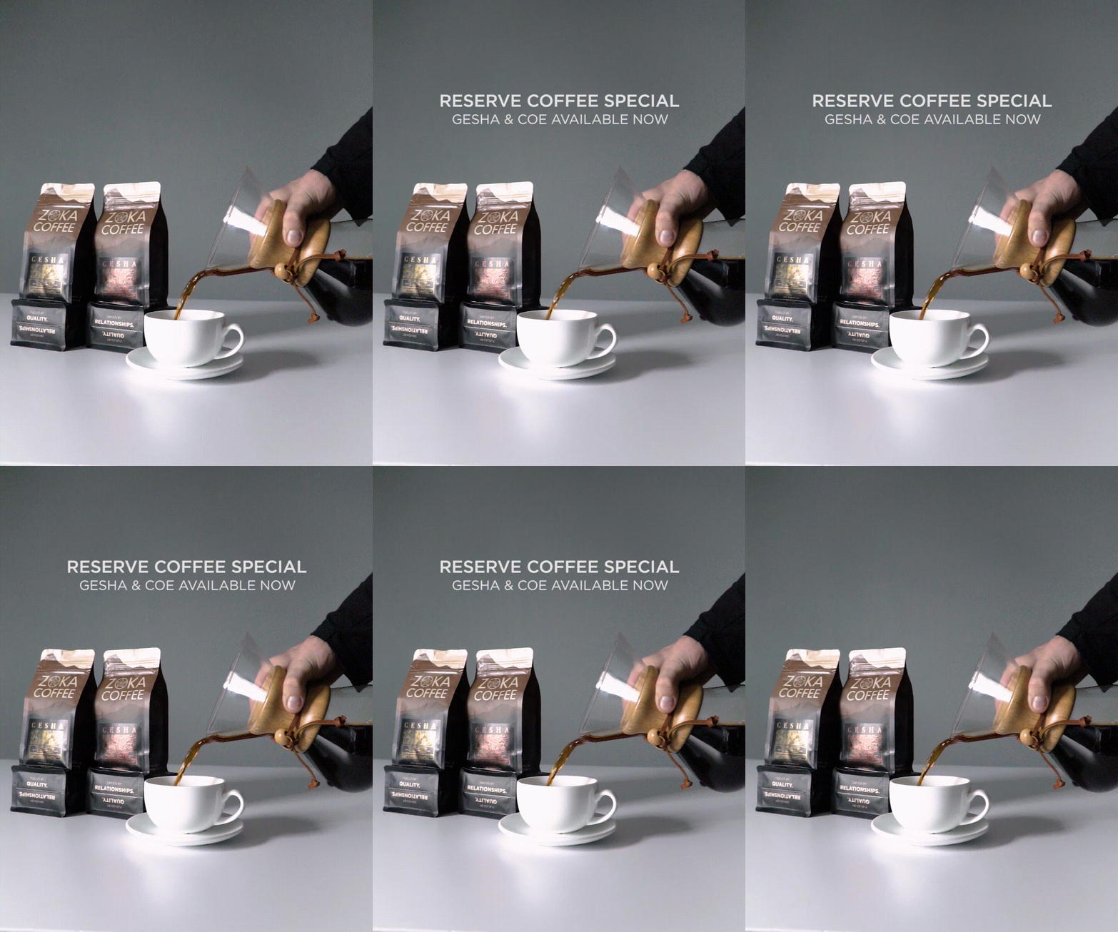
Zoka Coffee is an award winning coffee company with multiple cafes in Seattle. Their products are available in grocery stores, hotels, and affiliate cafes around the country through their wholesale distribution. Focusing on specialty coffee, ethical sourcing and relationships since 1996.
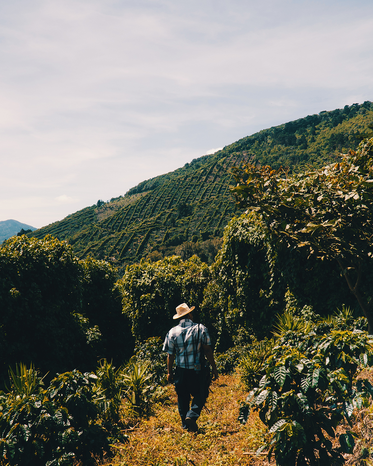
The beginning of my journey started with visiting single origin countries (Colombia, Guatemala, El Salvador, Costa Rica, Nicaragua) to learn how the coffee is sourced and capture the stories of farmers (through photo and video). Meeting the farmers and learning about the coffee process gave me great insight on how to reshape the Zoka Coffee brand.
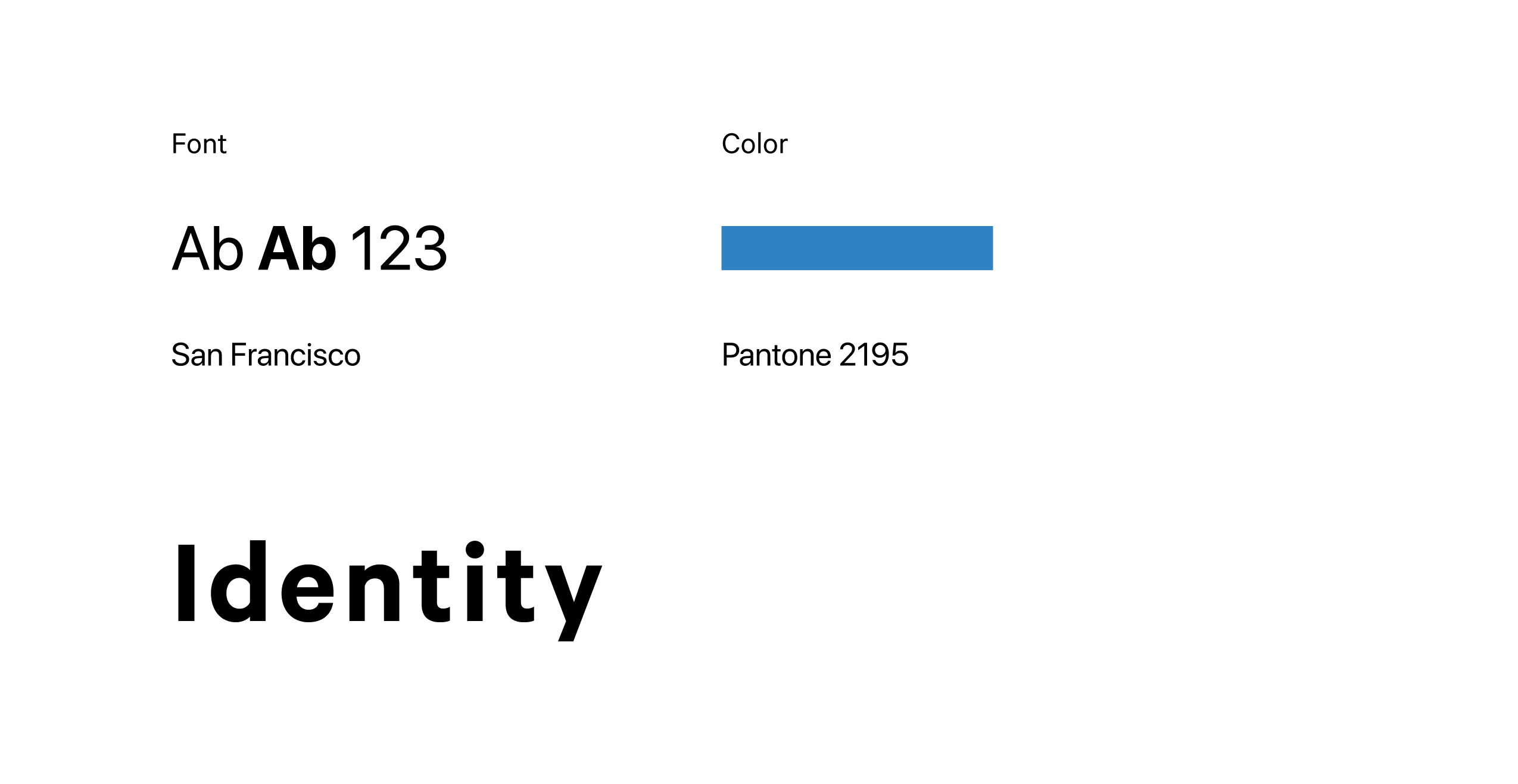
Identity
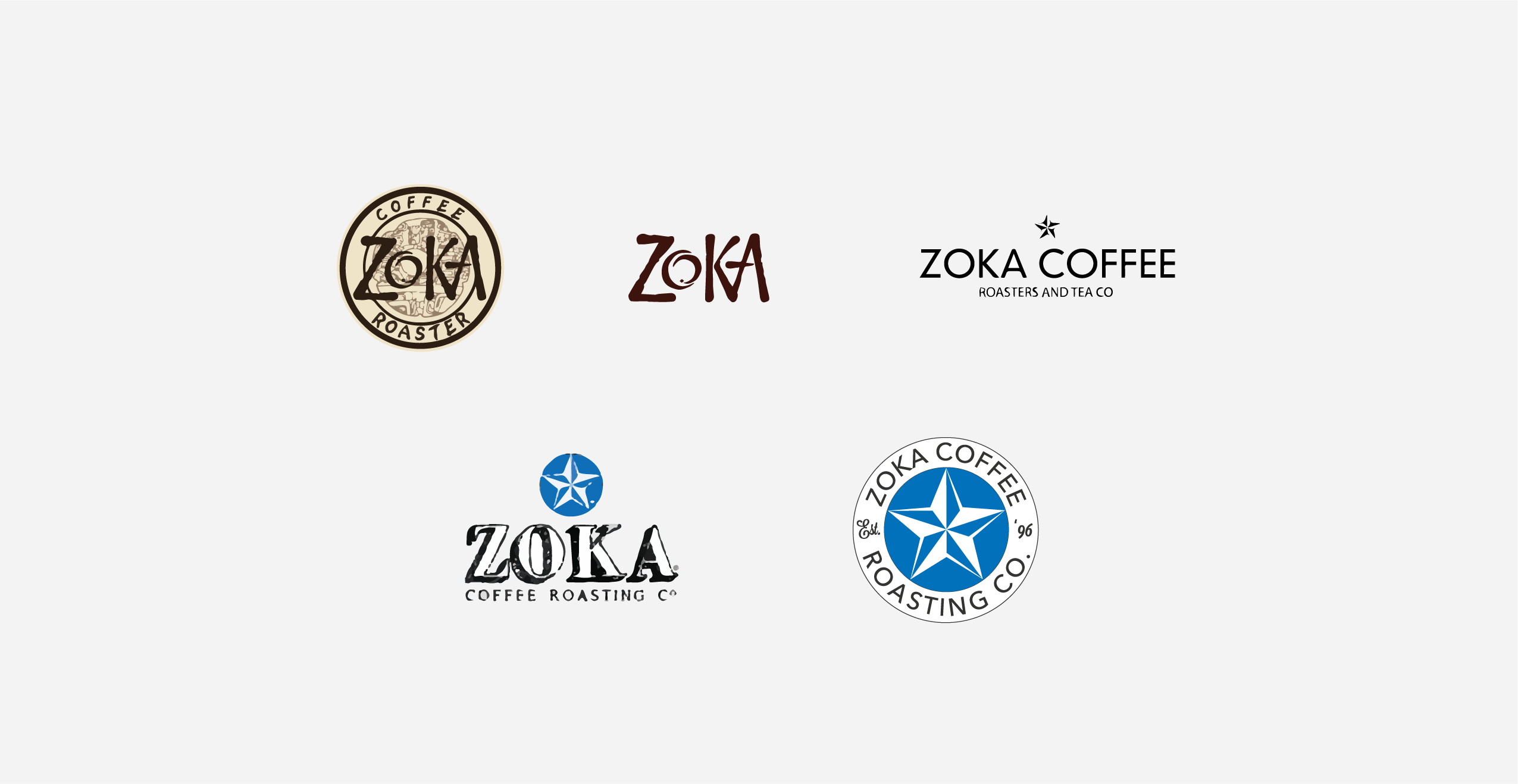
When I joined Zoka Coffee their branding was in disorder; mutiple logos were in use dating back to the 90’s and early 2000’s which tarnished the brand equity. All signage, packaging, print, and web material out of sync.
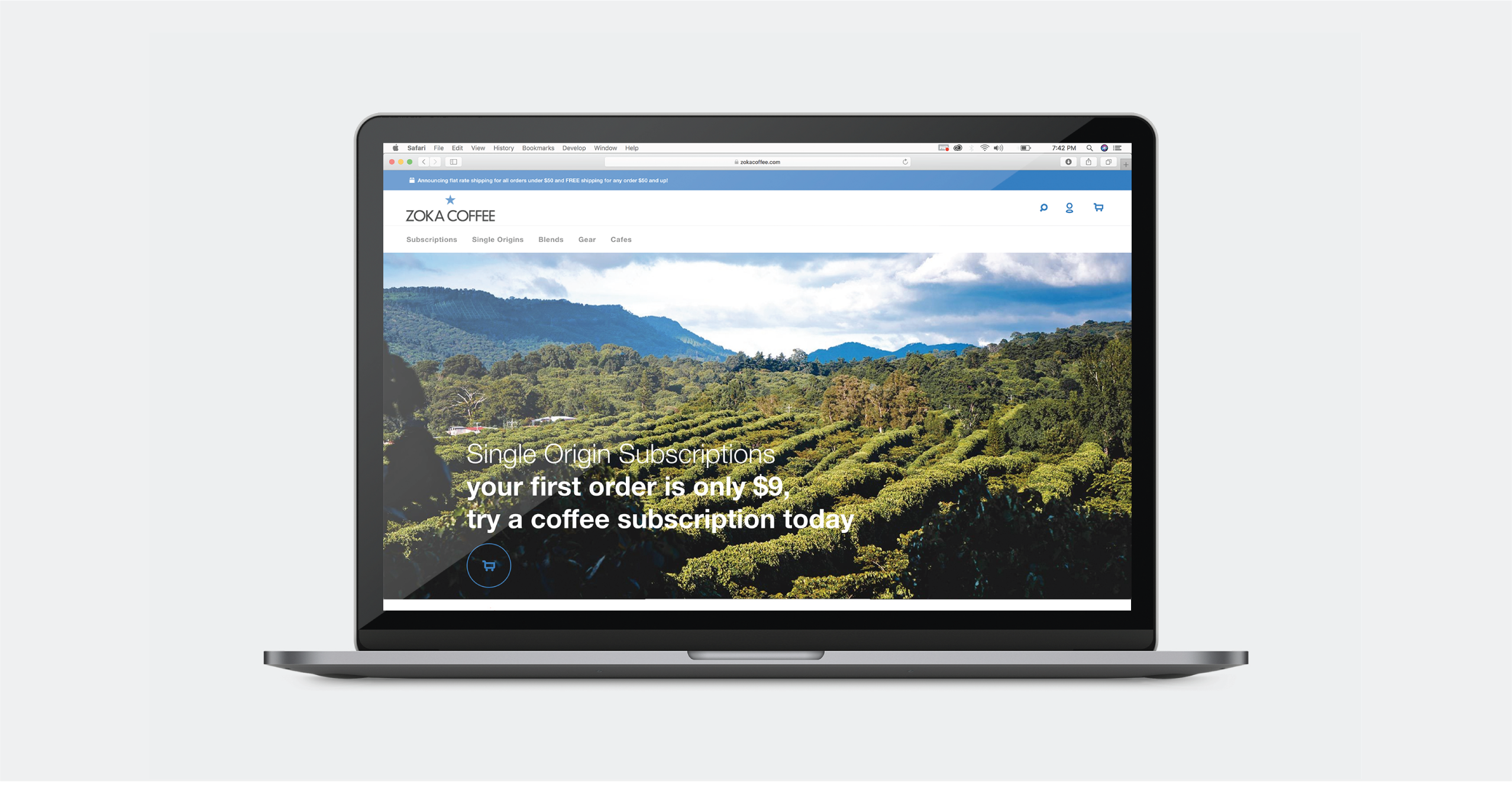
The solution to this began with redesigning the logo. It had to keep the essence of the old logos, married, giving birth to the child logo. The customers who visit everyday would recognize it as the same trusted coffee company they’ve grown to love, with room to reach a younger audience.
Signage
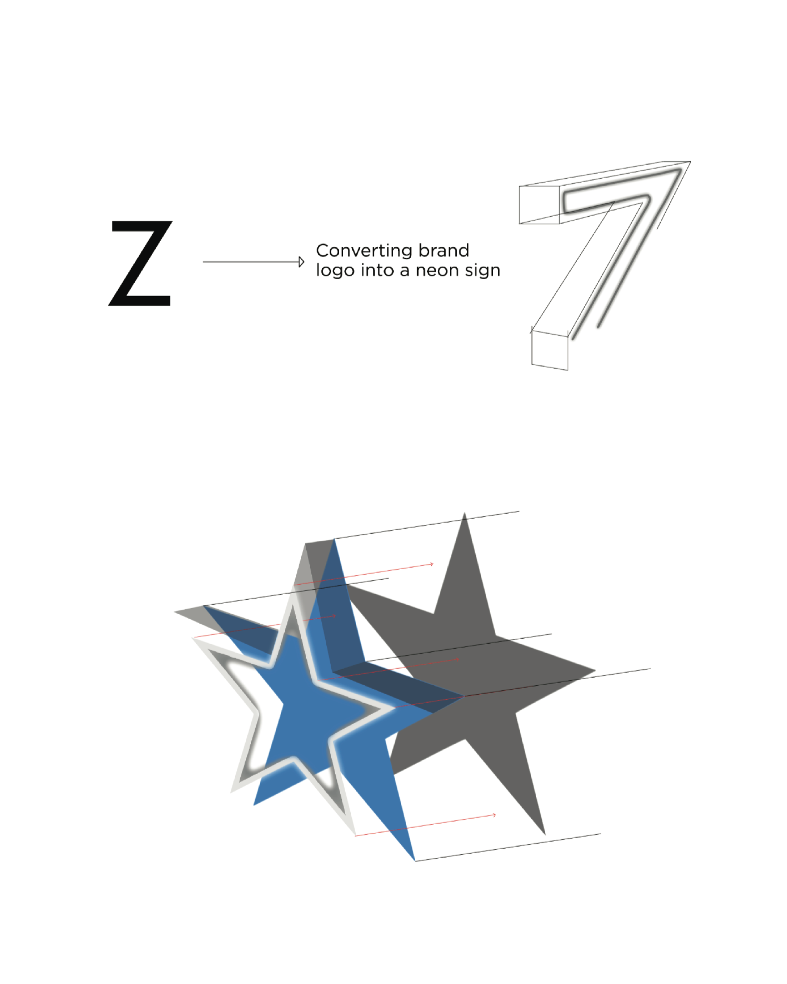
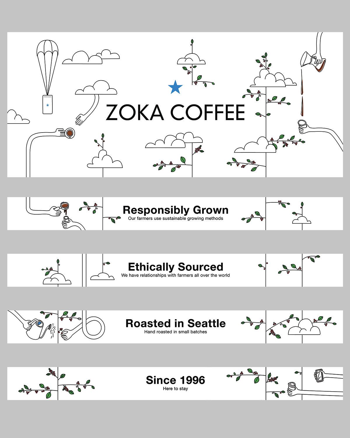
Converting the 2D logo into 3D neon signs was a matter of communication with the sign company. I sketched a wireframe of the sign to help sign makers correctly translate the font into a 3D sign, including color specification and font/logo files.
Menu
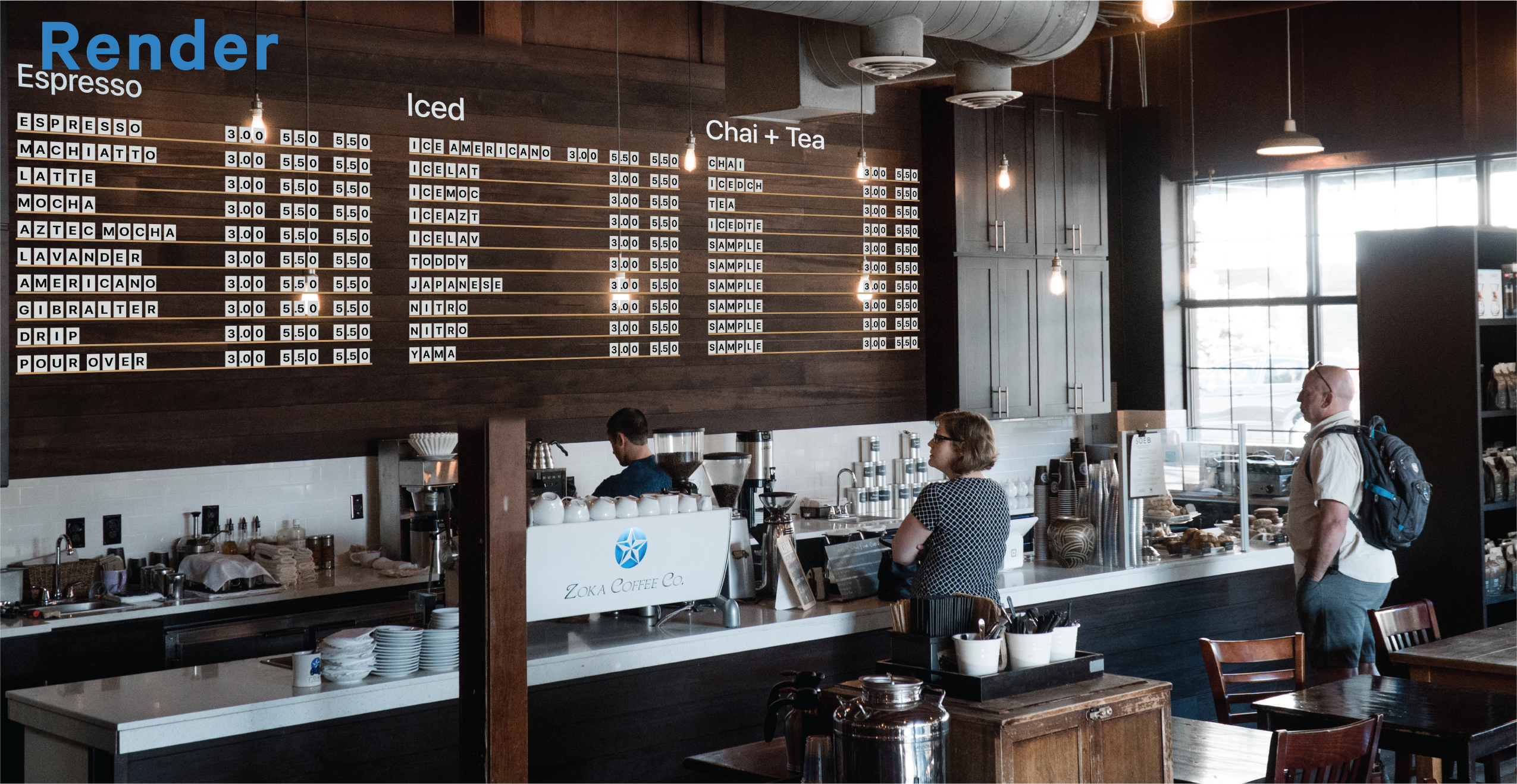
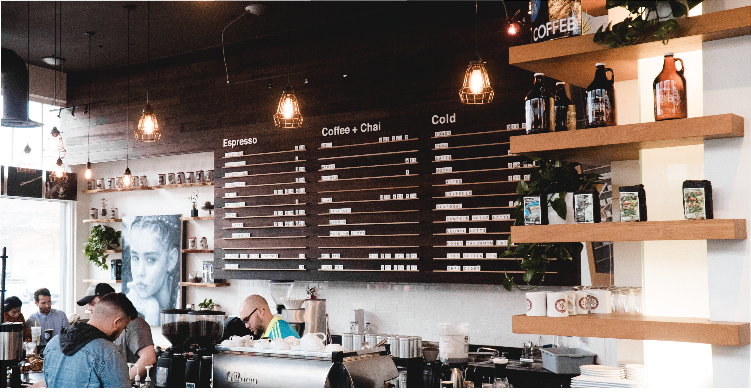
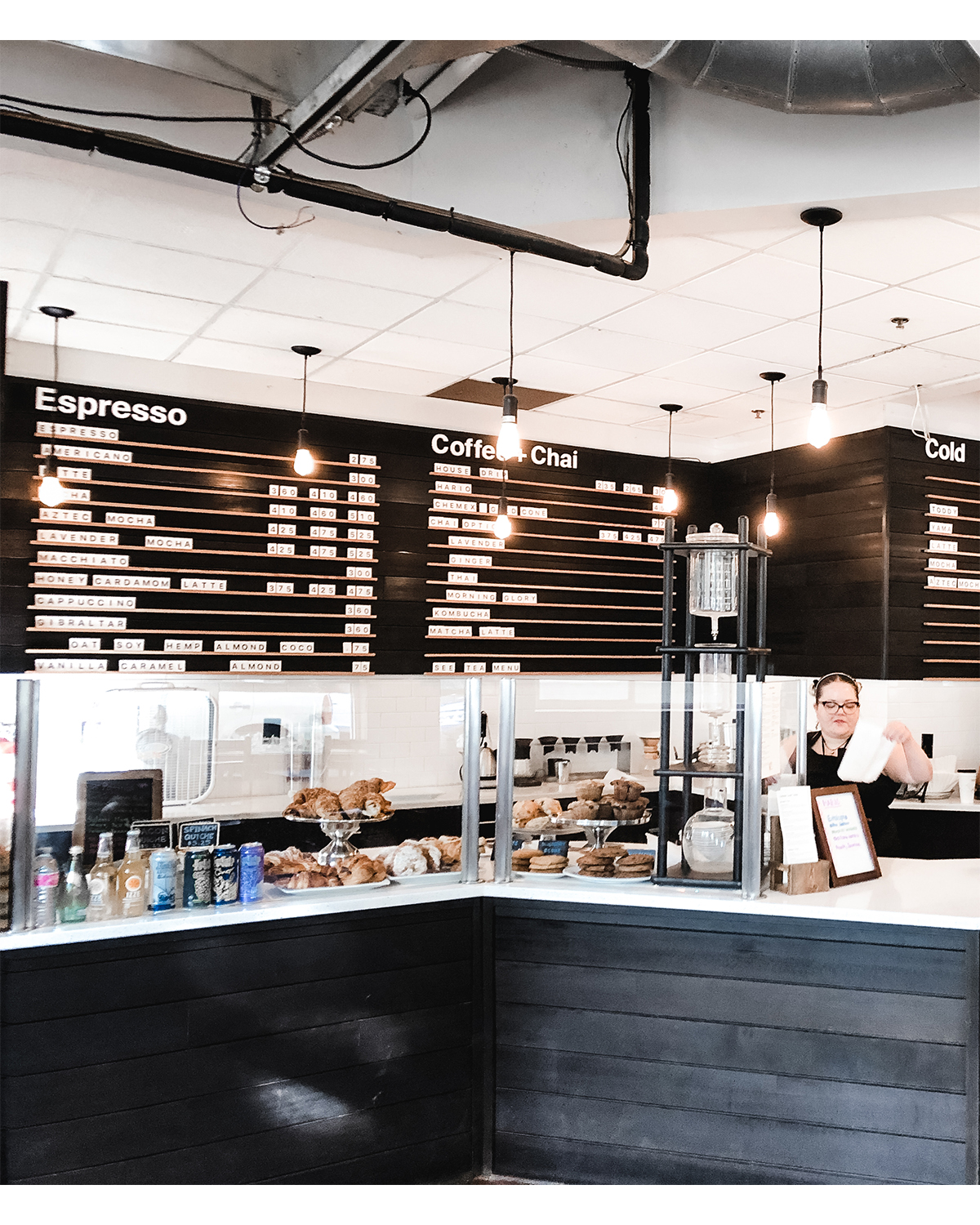
Unifying the brand between three locations was challanging because the interior aesthetic varied. To bring the cafes together I developed a concept for a menu that took up the entire back wall to double as a backdrop for photos. This entailed working with measurements, mock-ups, and multiple companies who executed the reconstruction of the back wall and pvc tiles with DTS printing.
Drink Manual
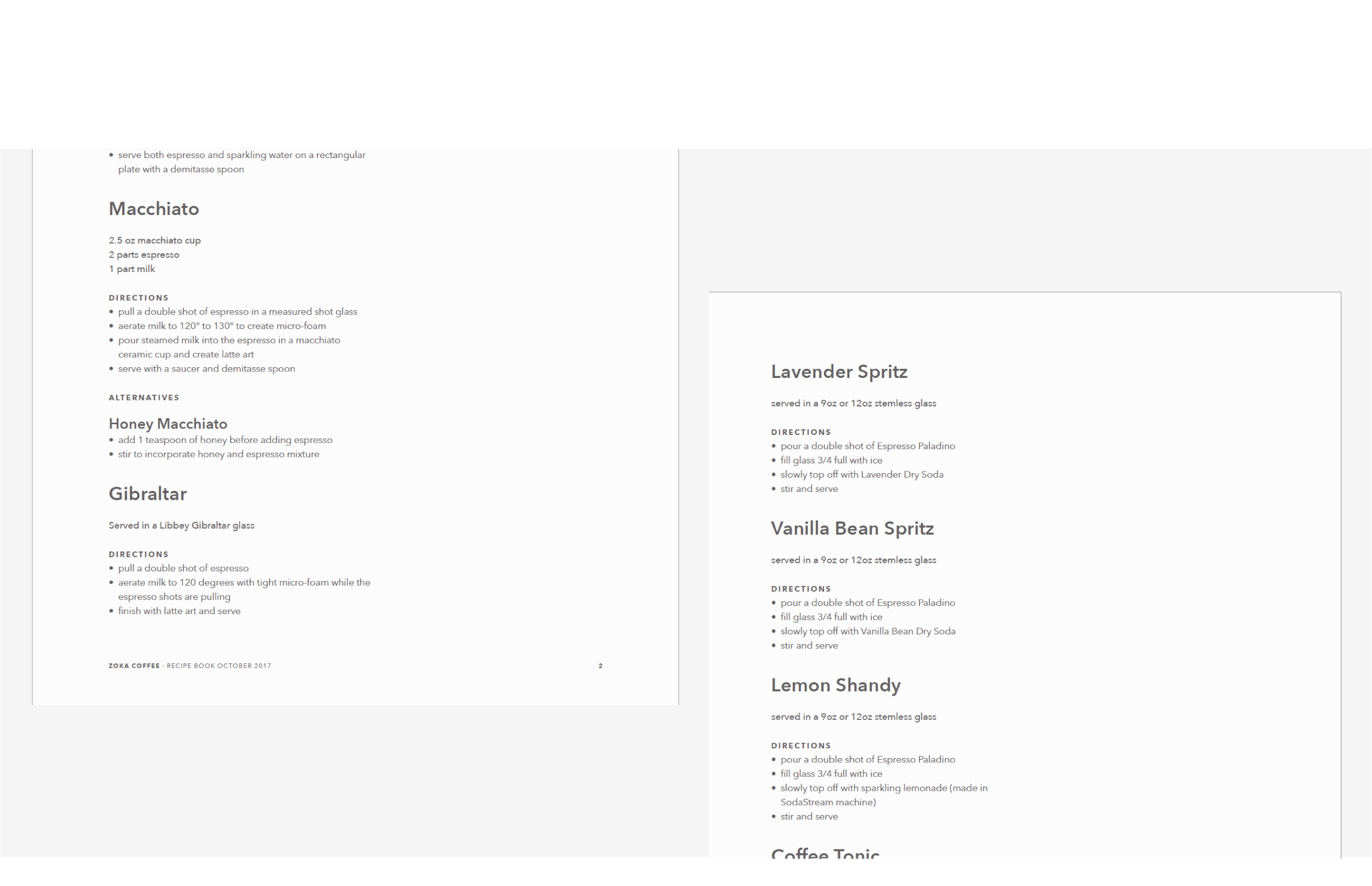
Consistant drink quality is crucial to retain a return customer. The drink manual was designed to equip baristas with everything they need to craft on-brand beverages.
Cups
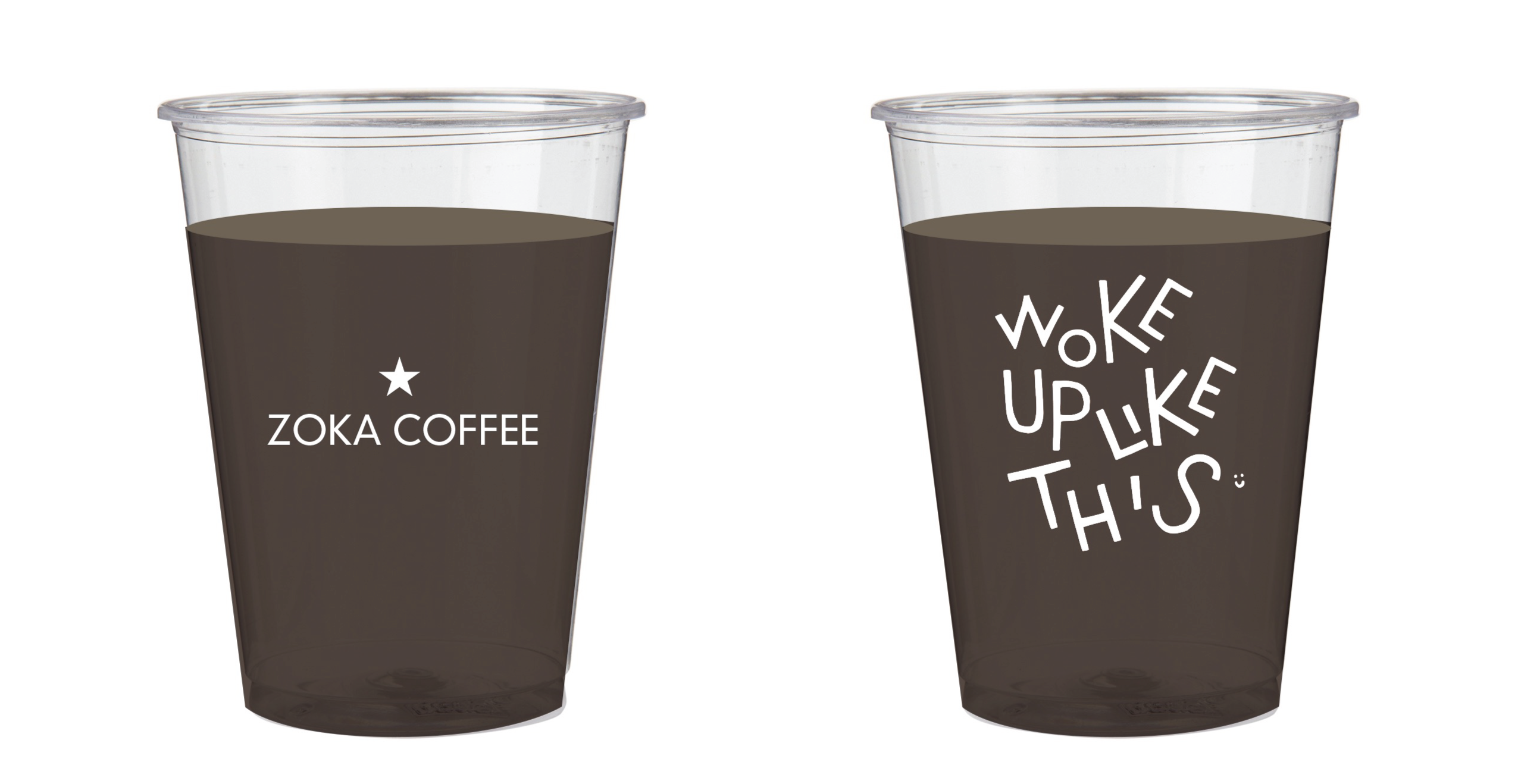
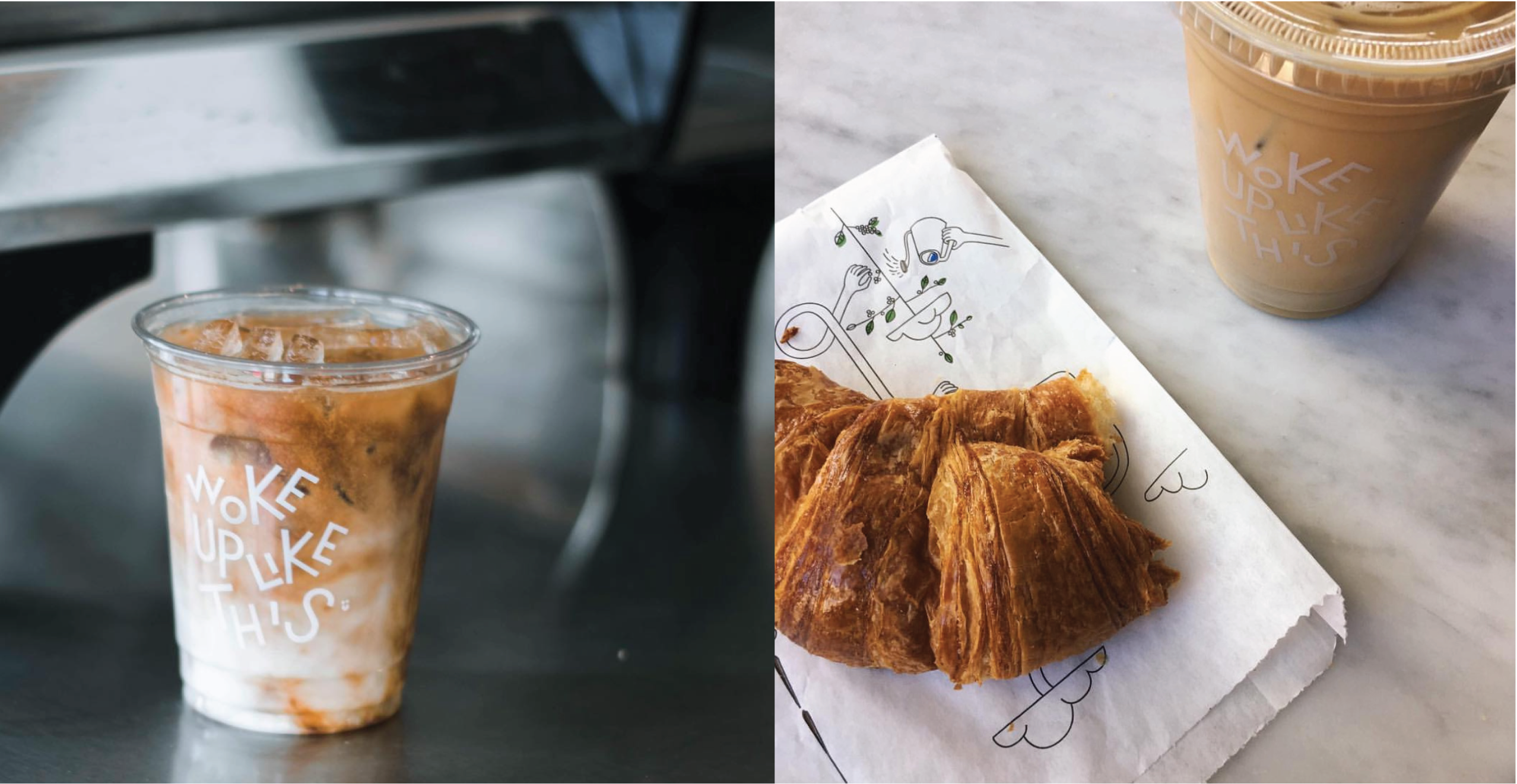
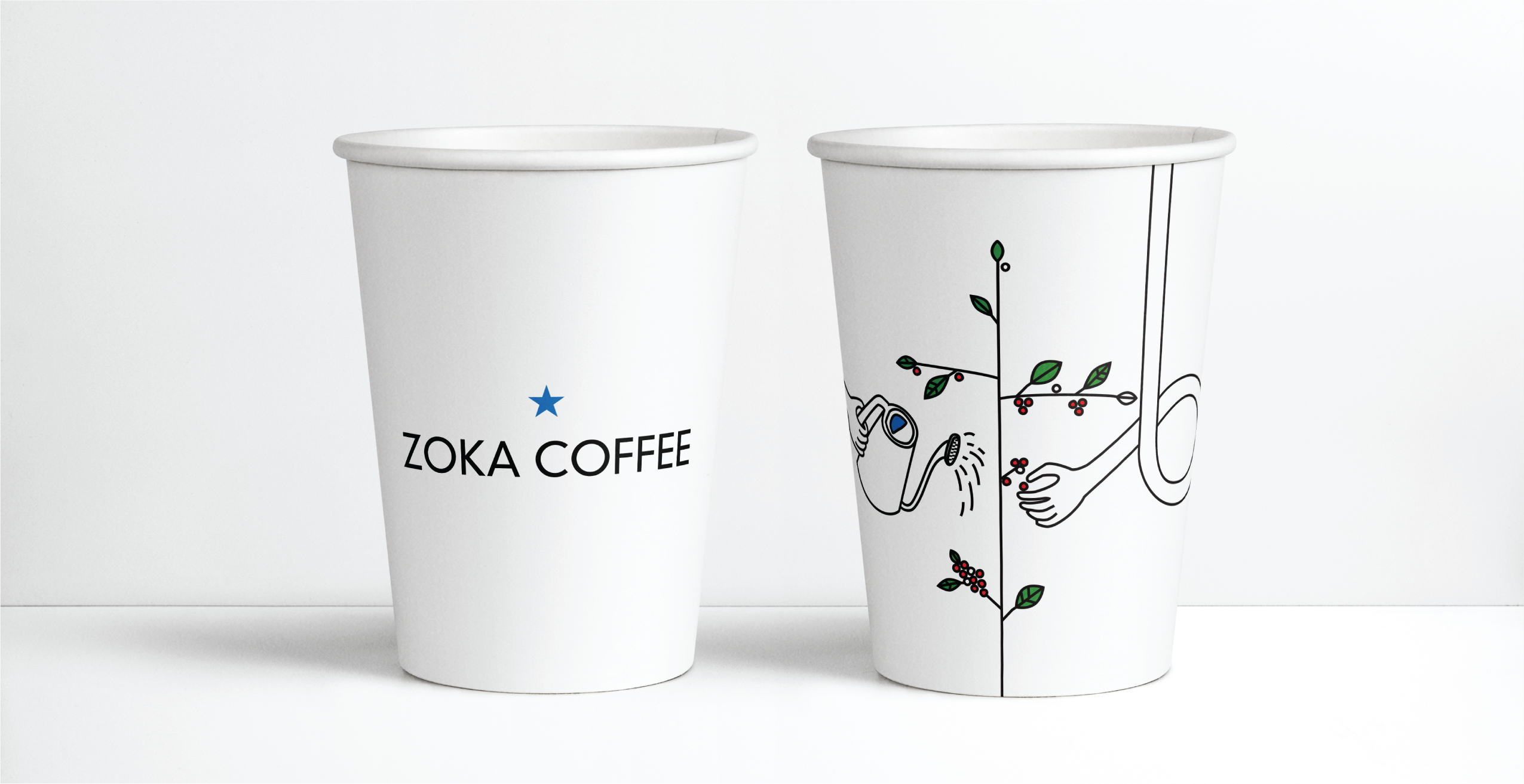
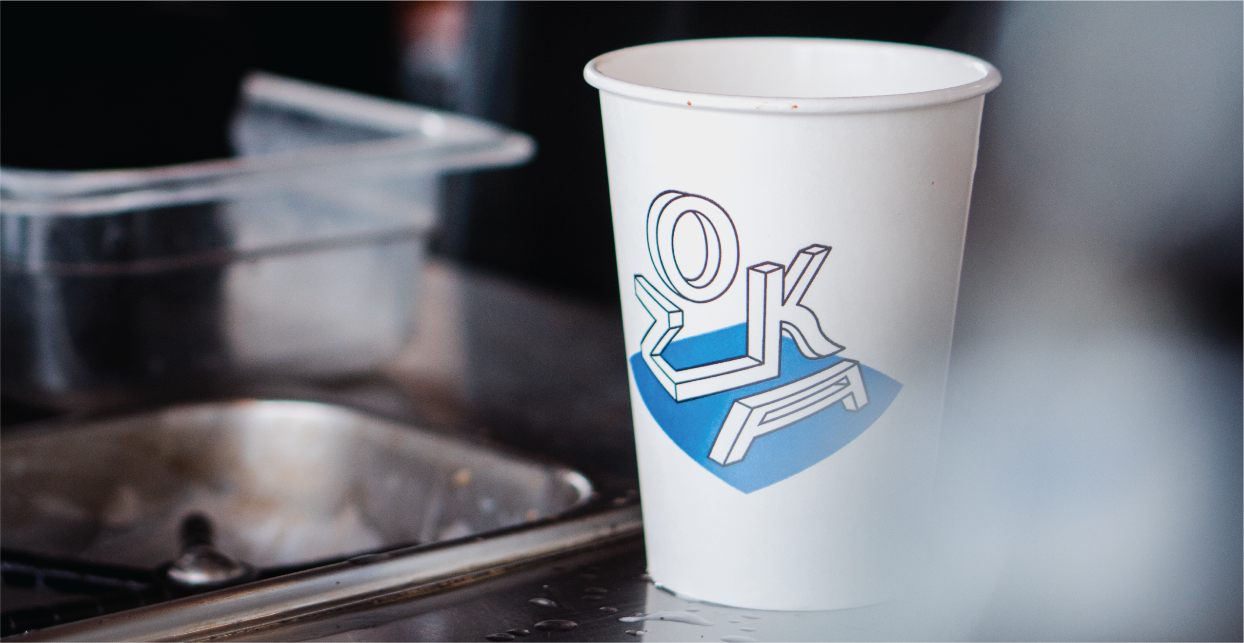
Studying the atmostphere of the cafe’s gave me a great insight into the target audience of the brand, which included a growing young crowd (noticeably at the Kirkland and University Village locations). This inspired the cup artwork, which was designed to encourage customers to share their beverage on social media. This proved very successful in generating social media shares and growing the page following.
Email
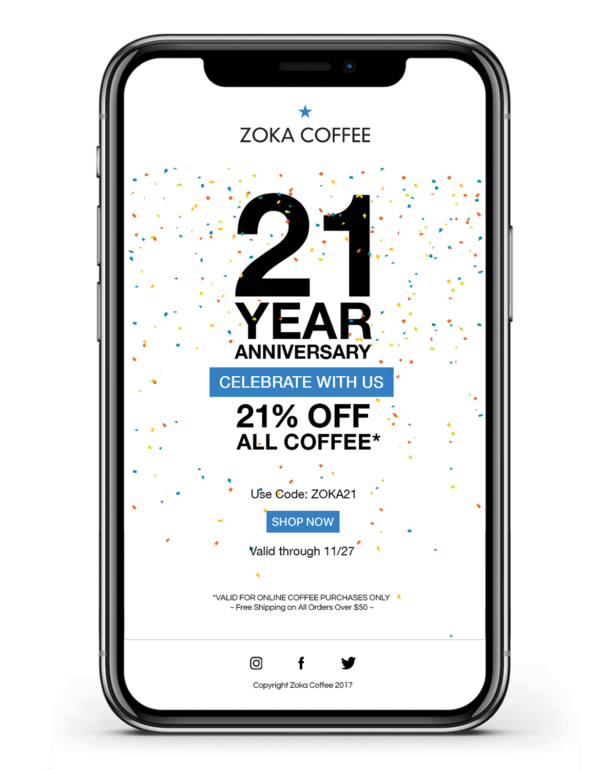
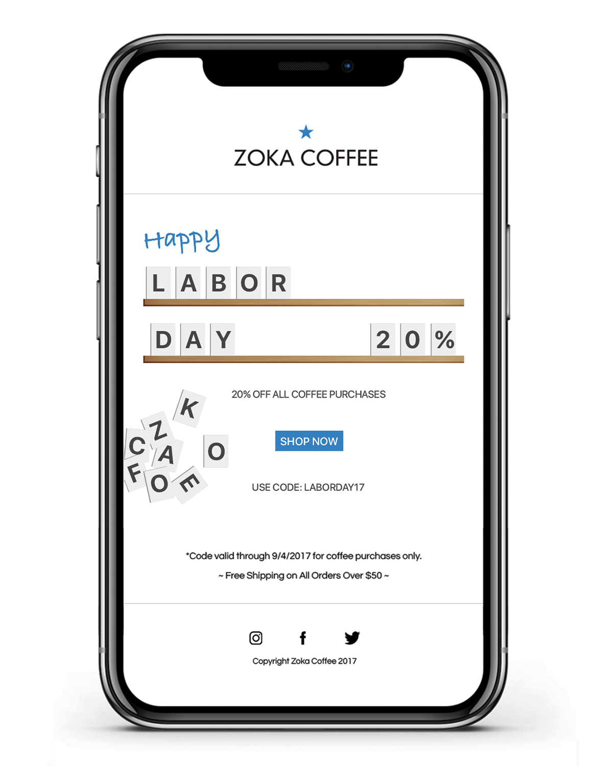
While running the company social media pages I was also involved in email marketing, using custom designed emails packaged for scheduling in MailChimp. The result of reaching an untapped subscriber list was beneficial.
Safeway Endcap
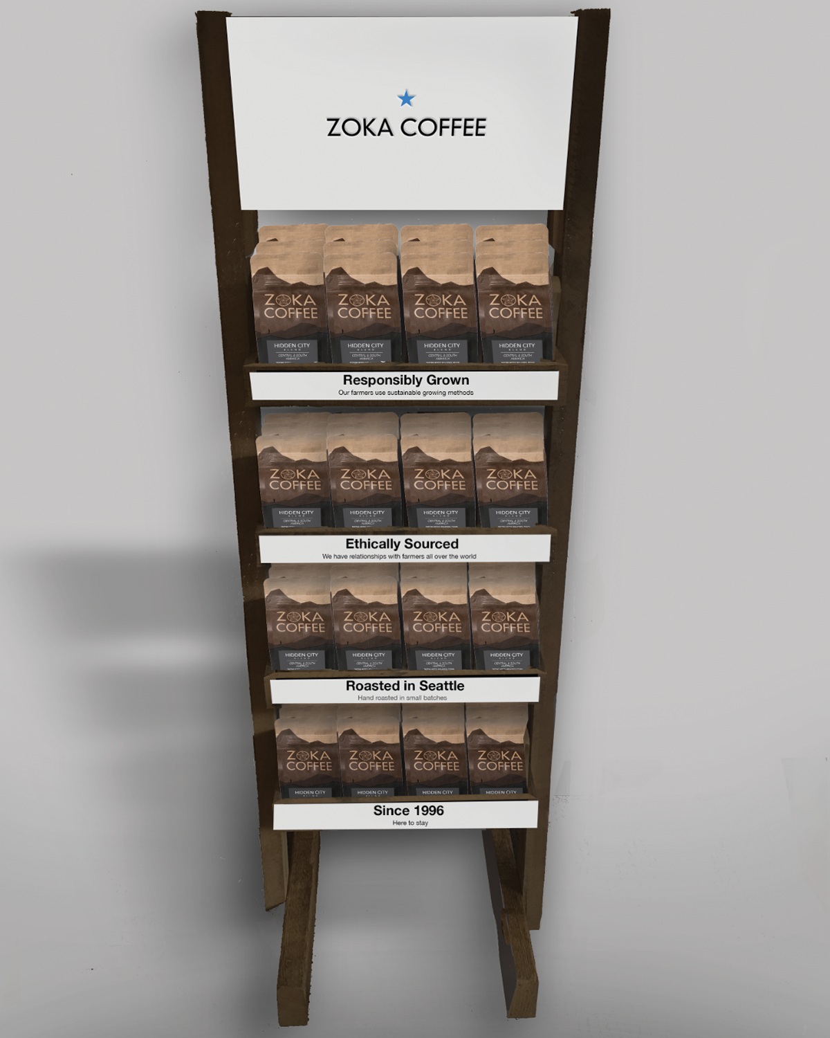
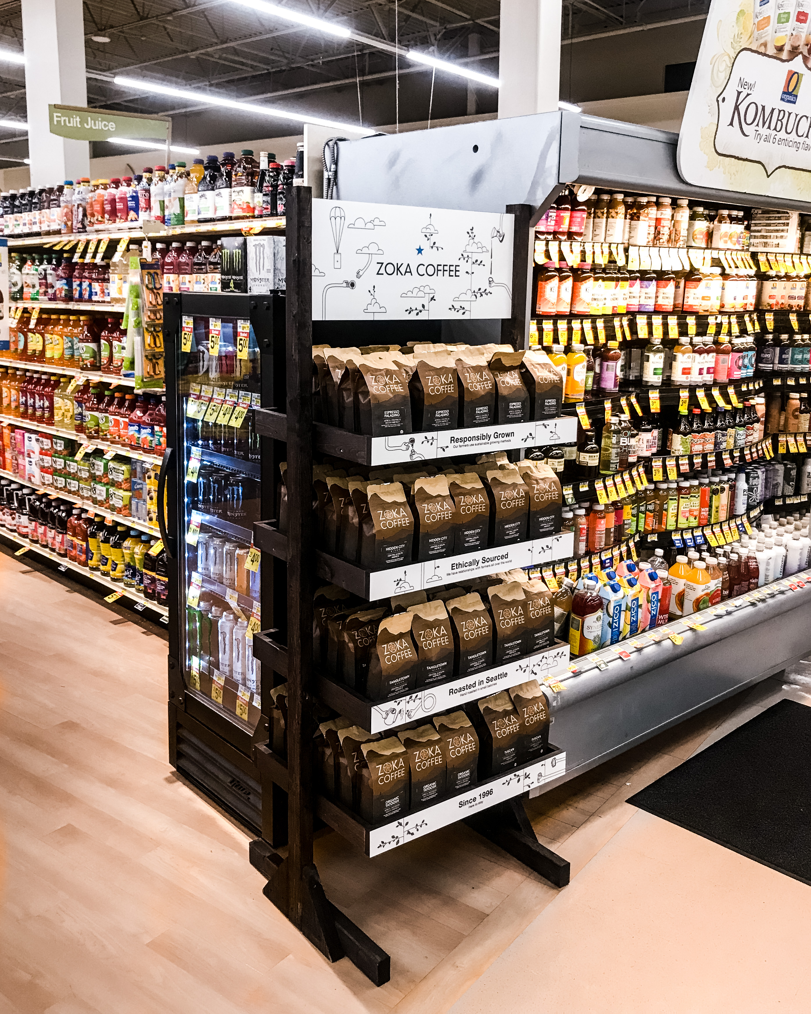
The limited time Safeway endcap program was in all participating greater Seattle Safeway locations. The endcap features copy that was developed to guide the rebrand. The design of the stand was specific to the amount of coffee bags it would hold, with measurments and schematics handed off to an outside company for construction.
Armistice Coffee
Branding
Logo
Illustration
Packaging
Marketing
Social Media
About
With two locations in Seattle, Armistice is already proving to be a community favored study hub, hang out spot, and second home for all ages.
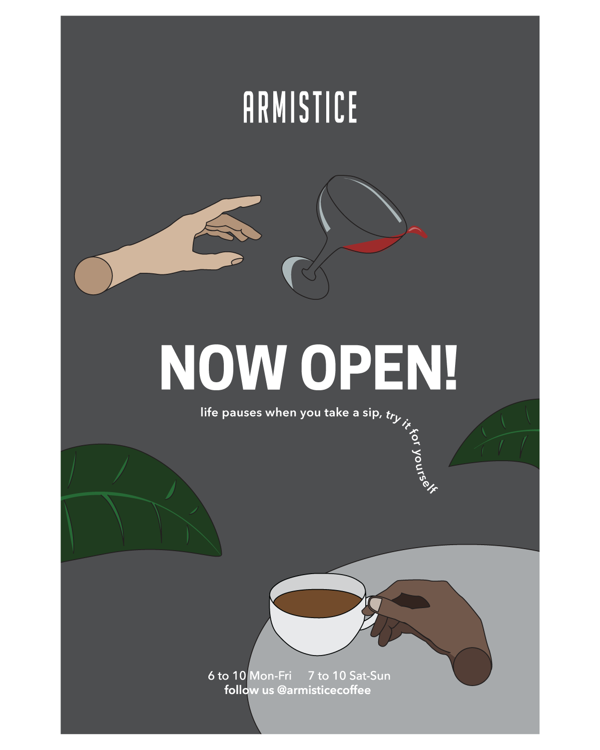
When I started working with Rebecca Smith (co-owner of Armistice) the first location had just launched with one logo (which had been outsourced overseas). My role was to help her shape the brand into the coffee company of her dreams. I was in charge of graphic design, social media, along with marketing responsibilities.
Identity
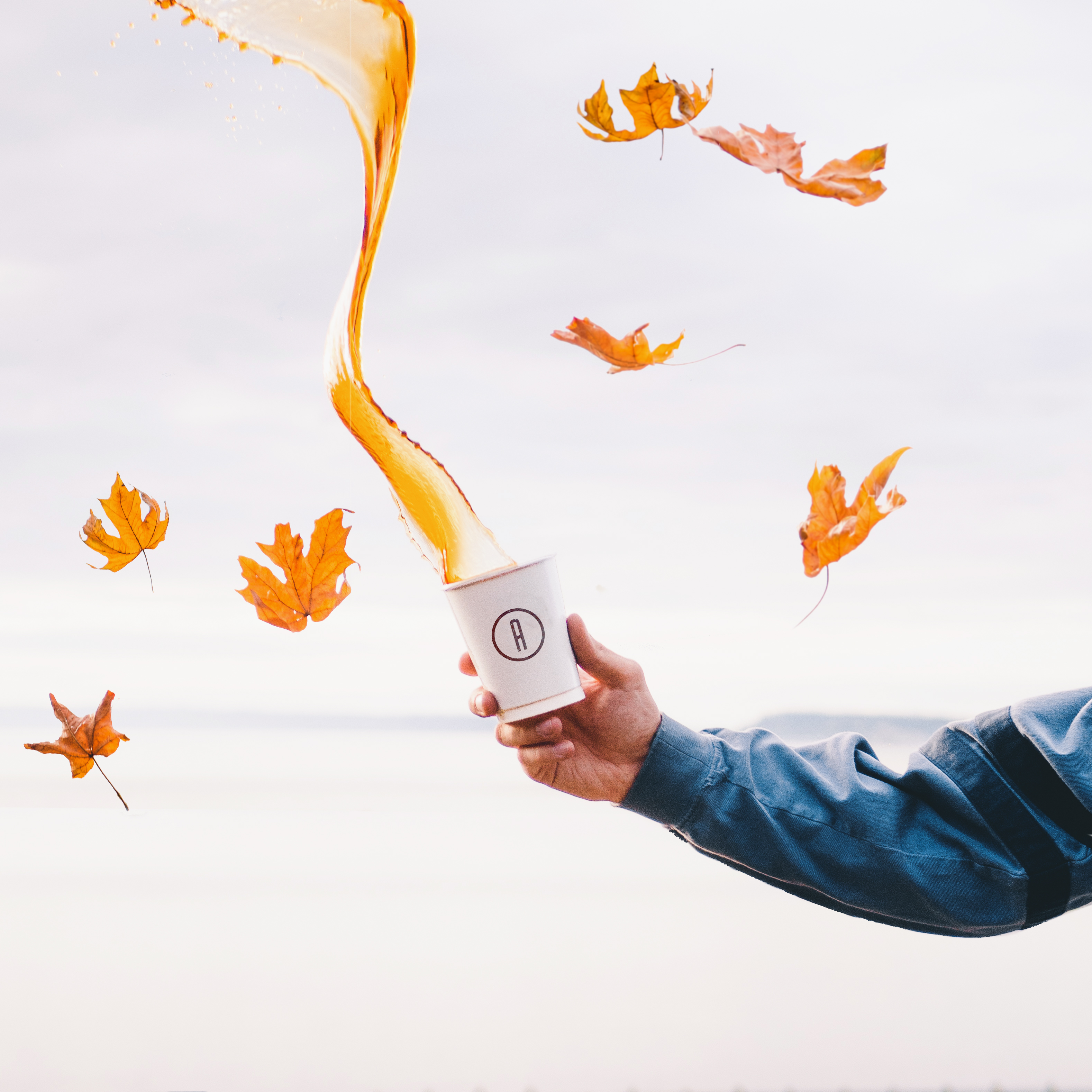
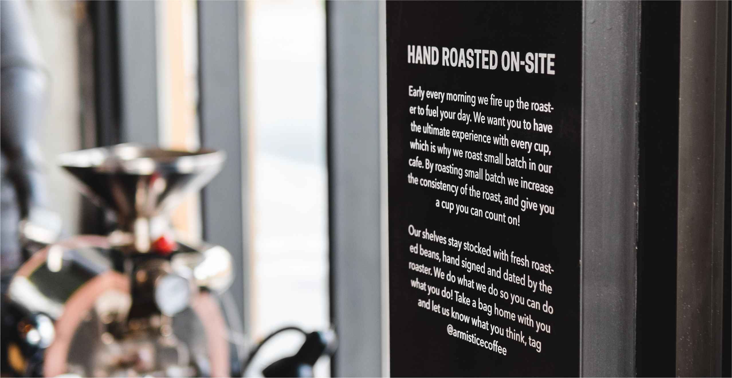
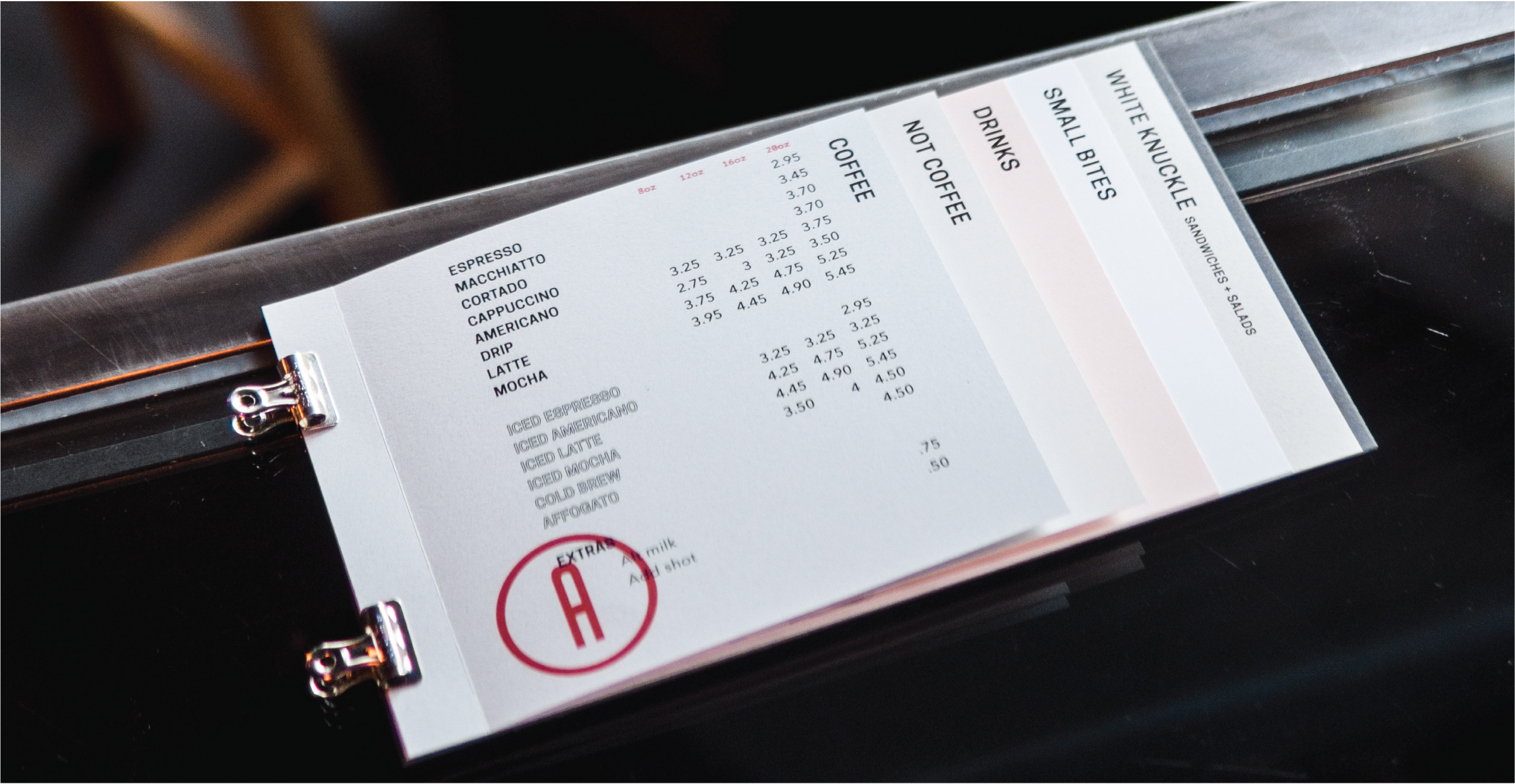
My work began with logo adjustments, which led to the creation of a lettermark. The lettermark allowed easy in-house branding of cups (with stamps registering >90% of the lettermark vs the old logo at <50%). The logo was then applied to the door, along with a roasting statement next to the roaster (copy edited and written in part by me).
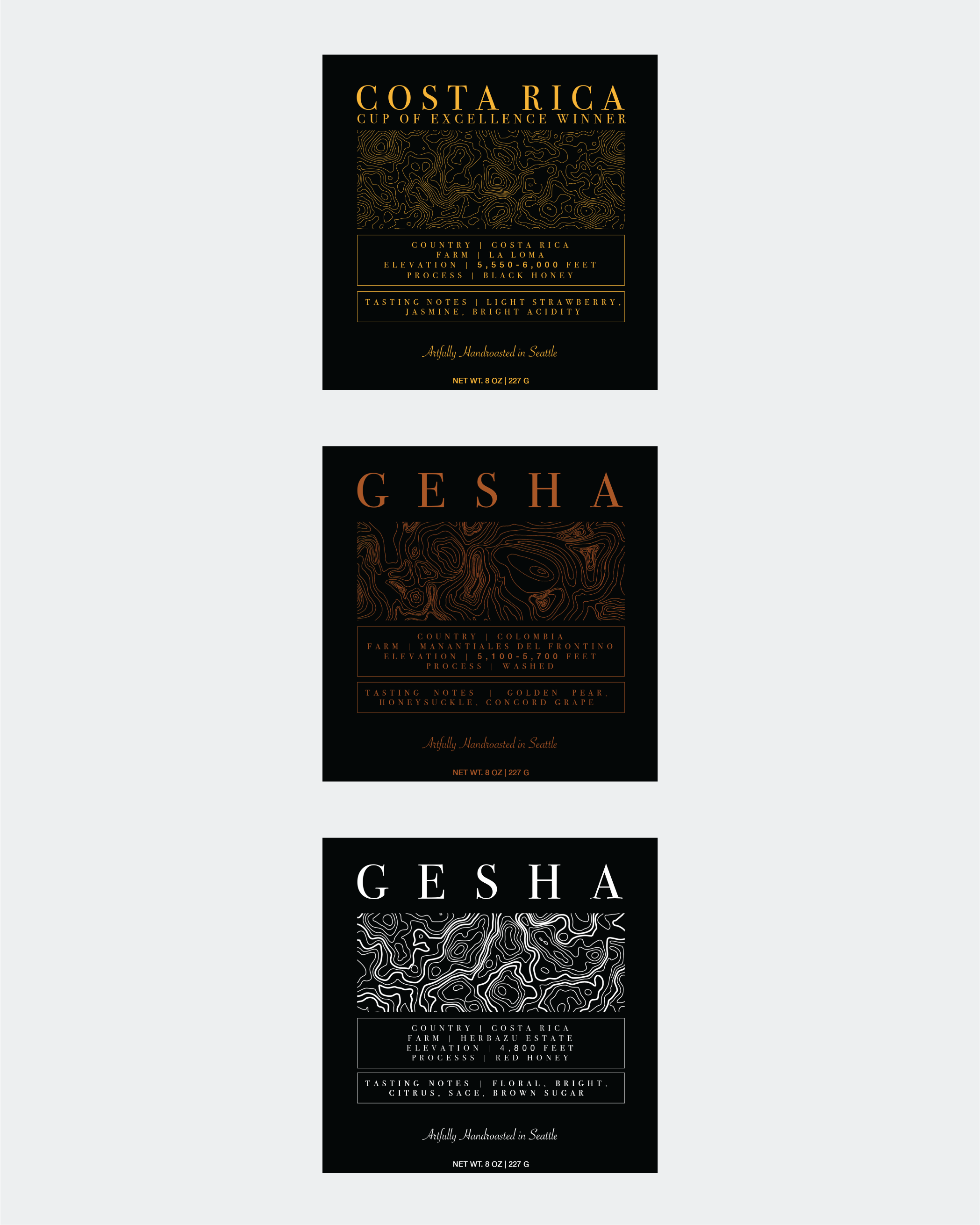
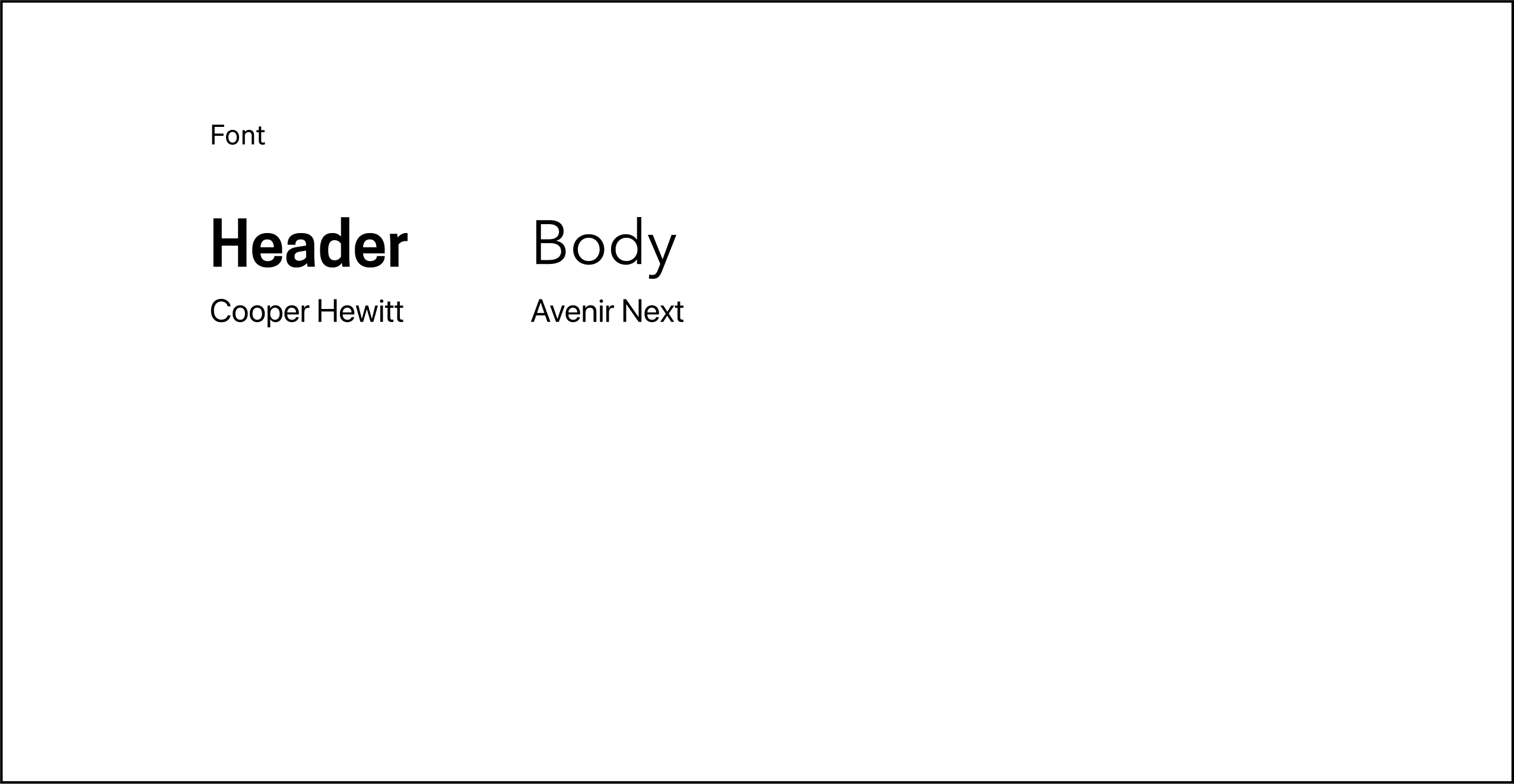
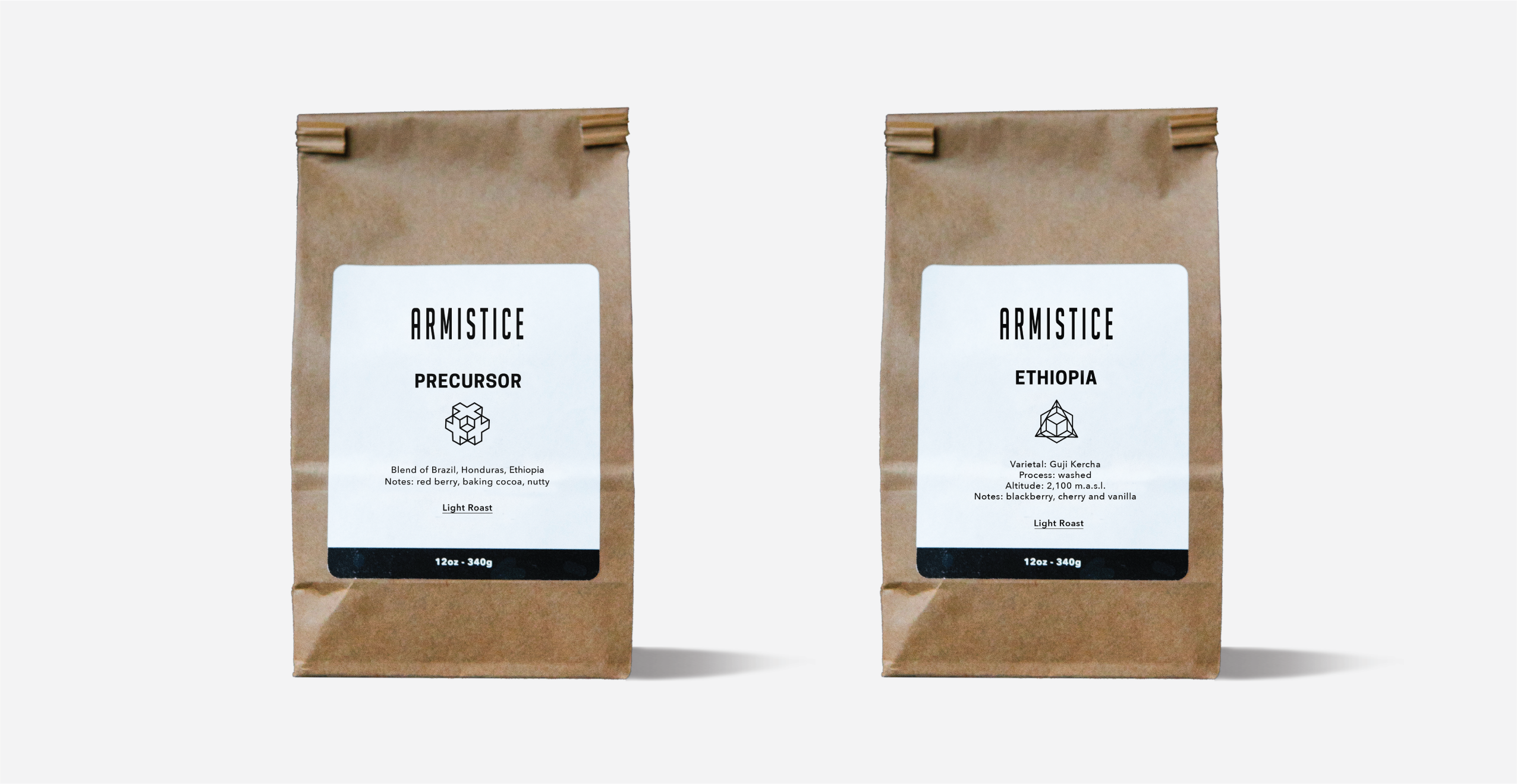
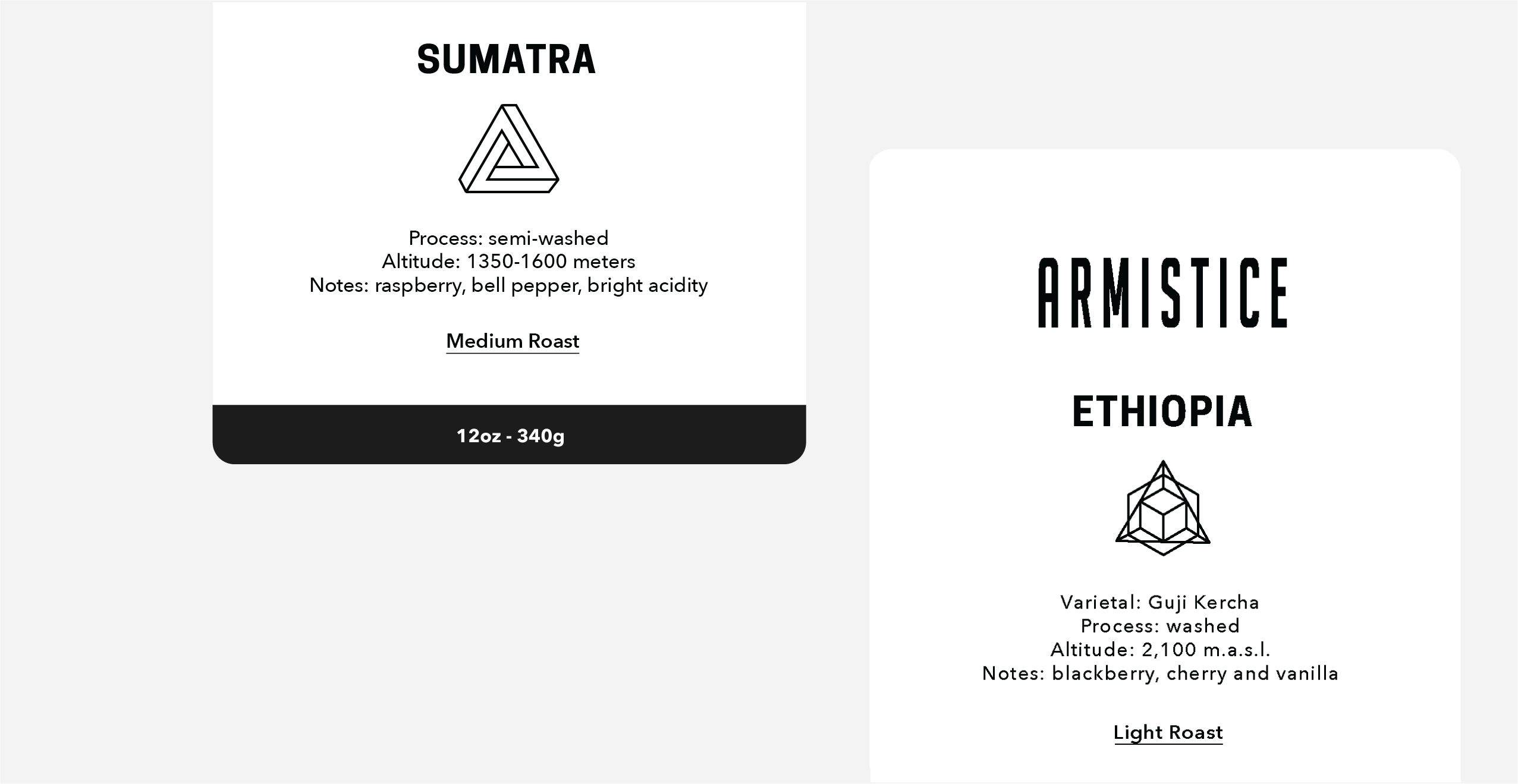
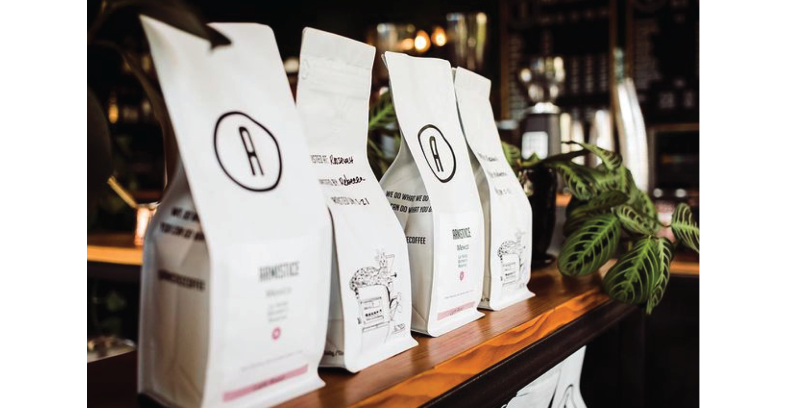
After deciding on suiteable fonts to compliment the logo I developed a system for printing coffee bag stickers in-house to minimize business expenses. The design of the label features geometric shapes for each variety of coffee to invoke a feeling of certainty, which correlates to the consistency of the coffee.
Website
Following this I set up the website, preparing Armistice for the online marketplace. This included photography, asset creation, and web development.
Artwork
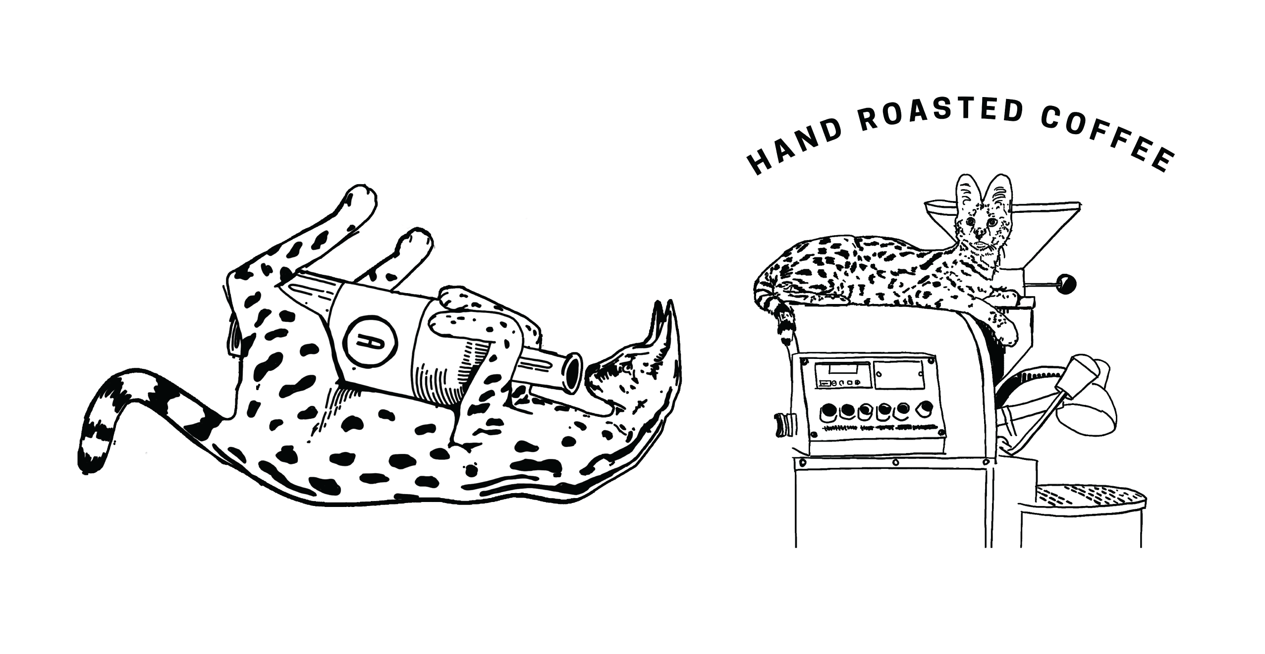
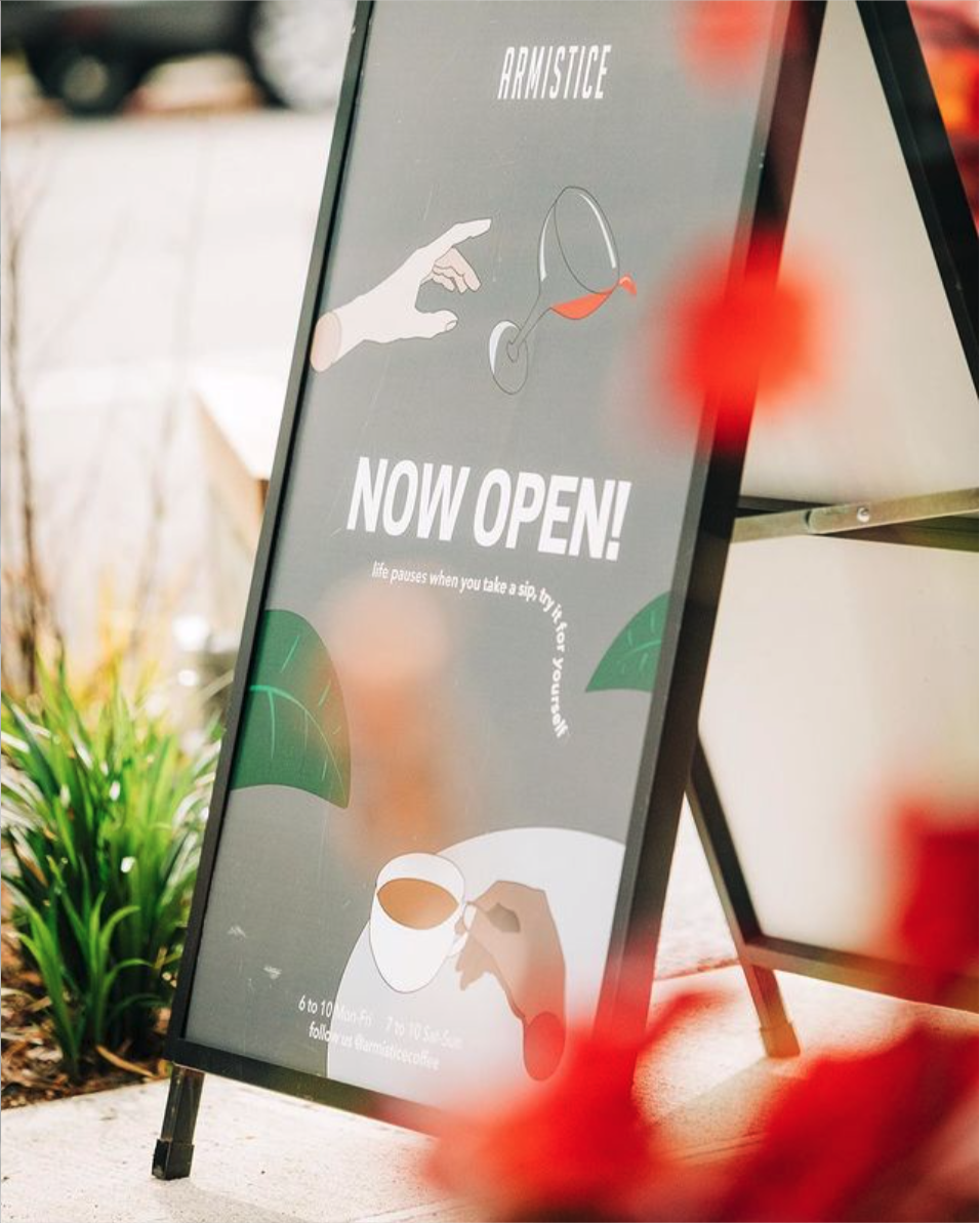
Artwork created for Armistice hid easter eggs which made it delightful. The premise of the seasonal ghost A-frame is that ghosts need coffee to stay up all night in order to haunt, even if they’re rather messy at consuming it. The savannah cat drinking out of a bottle and resting on the roaster is a nod at Rebecca’s own cat Archer who, in his meschivious nature, is likely to spill a bottle (he doesn’t consume alchohol don’t worry!)
Brand Discovery
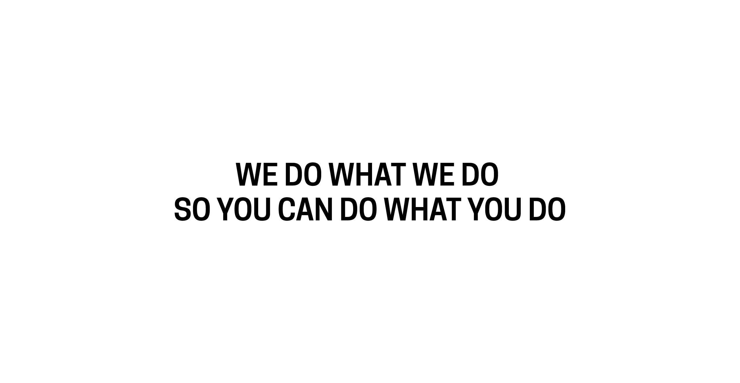
During my brand discovery sessions with Rebecca Smith we arrived at a brand promise “we do what we, so you can do what you do” which is now featured on new packaging (designed after our partnership). Along with this statement the packaging features my illustration of Archer on the roaster. Photo courtesy of @armisticecoffee Instagram.






203ºF Coffee
Branding
Identity
Positioning
Pitch Deck
Copy
About
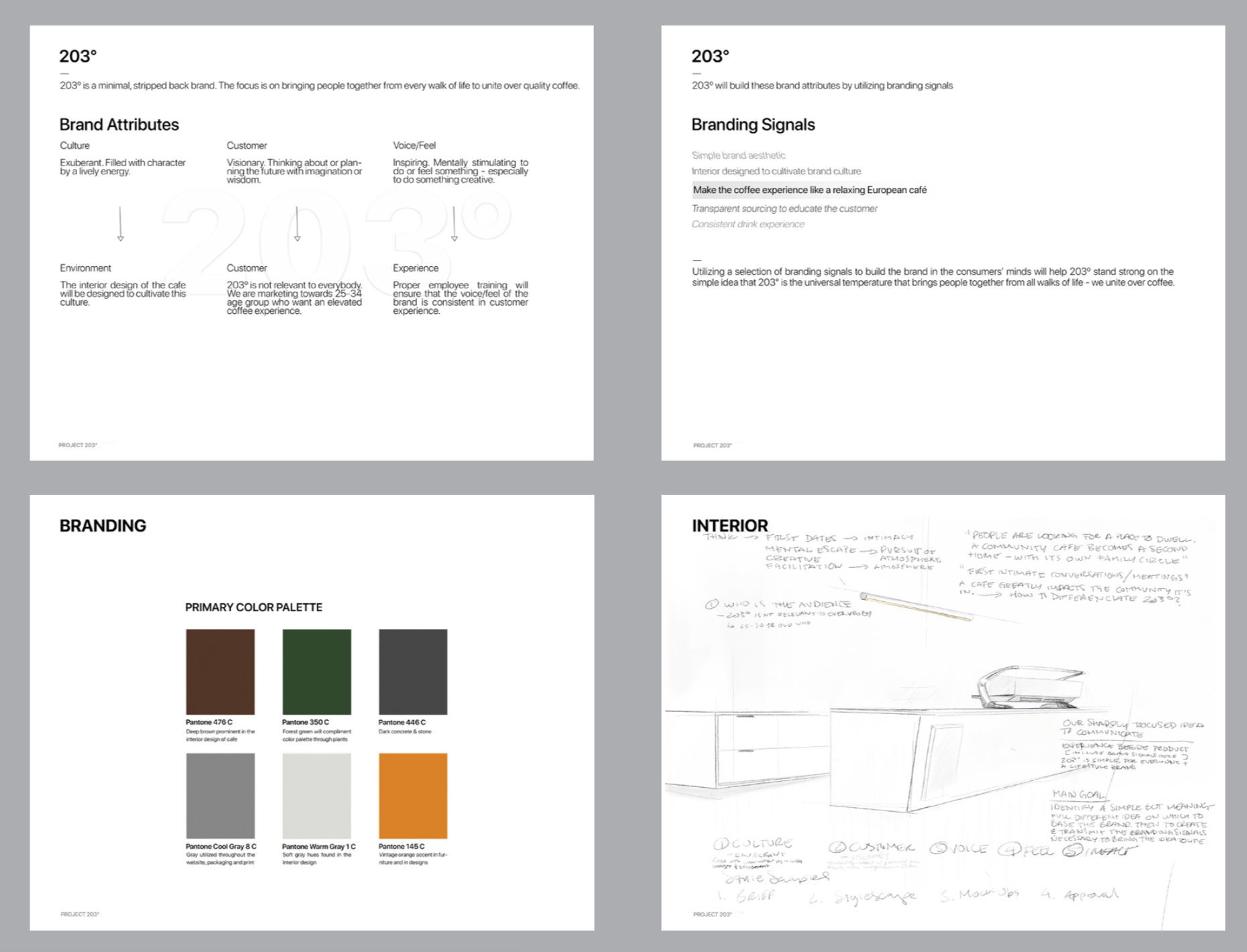
203º is focused on a specific target audience - charging premium prices and paying high attention to service, customer experience, and product quality. After a successful first location 203º is working on their second location in collaboration with Google.
Work
The goal of this project was to create a pitch deck for a multi-million dollar café installment in order to raise funding. With full creative autonomy I worked on the brand positioning, target audience, and even the direction for interior aesthetic. This pitch deck was then presented by the company representative, and the project was greenlighted by investors.

